Followers

Monday 7 November 2022

Inky Skies

Hello everyone, I hope that you are keeping well. I am sharing a couple of projects today using stamps featured in our latest TV shows from Create and Craft.

My first project mixes stamps from the stamp sets Celestial, Sacred and Owl Edges. I first stamped the circle frame, and then placed a mask around the edge of the circle. I stamped the bull rushes into the circle and added the moth, before removing the outer mask, and covering the circle with a mask of its own. I coloured the background using Wilted Violet and Blueprint Sketch Distress Ink, then spritzed the background with gold Perfect Pearls spray.

I removed the circle mask, and painted the inner background with Salty Ocean, Peeled Paint and Picked Raspberry Distress Oxide.

 The two frames on the Celestial stamp set are just perfect for creating little scenes, and I can imagine using them with so many of the Chocolate Baroque silhouette stamps.

To create my second card, I used a wrinkle free Distress background that I already had in my stash, created with blue and green Distress Ink. I know that I used Salty Ocean and Twisted Citron, as they are my go to colours. I blended Wilted Violet, Blueprint Sketch, and Uncharted Mariner over the top. Once this was dry, I added a little bit of white liquid pencil here and there, and embossed the large moon, some stars and the word Celestial, using Versamark and white embossing powder. I added some Weathered Wood Distress Ink to the moon to add a bit more definition.

I will be back later in the month with some Rennie Mackintosh inspired projects.


Thanks so much for stopping by,

Take care, xx


Saturday 1 October 2022

A Big Post Today!

Hello everyone, I hope that you are keeping well. In a change from usual procedure, I am only posting on my own blog this month, as the Design Team blog at Chocolate Baroque is closing down. We have decided, due to decreasing visits from viewers, and ever increasing popularity on other forms of social media, like Facebook and Instagram, that we will discintinue the blog. It is still there, if you wish to visit the archives, but we will not add anything new.

I have a bumper packed issue today, with projects from last month's TV shows, plus some older projects using stamps from the TV shows that some of you may have seen before. I hope you will enjoy what I have to share with you.

My first set of projects were made using a stamp from the Shaded Baubles stamp set, and I wanted to show that you could use this stamp all year round, it is such a versatile stamp. The stamp set is essentially a Christmas stamp set, but you can make cards for any occasion using this stamp.

My first two cards started out in the same way, I made a Distress Ink background in shades of blue and purple. For the first card, I kept the background plain, but added a sentiment from the Kings of the Orient stamp set, stamped in dark blue. I coloured a piece of Drawing Cartridge with Distress Oxide in blue and purple inks, and stamped the circle from Shaded Baubles with the dark blue ink, adding an image from the Following Yonder Star stamp set. I added highlights with a white gel pen, and cut the circle out. I adhered the circle to the background, and edged the background with the dark blue ink, before attaching it to a card blank.

The second card was made in pretty much the same way. I stamped the text from the Gold, Frankincense, Myrrh stamp set all over the background using a purple ink and added some shading around the edges of the background using purple Distress Oxide. I masked a section of the image from Kings of the Orient before I inked it up using masking tape, as it was slightly too long. I only wanted the tree and part of the building. I added a star and again used a white gel pen for highlights. 


To create my alternative season cards, I sprayed a piece of Drawing Cartridge with some green ink and left this to dry. I added some colour around the edges with Seedless Preserves Distress Ink, and stamped a little leaf from the Hyacinth stamp set all over the background using green ink. I used the same green ink to stamp the circle from Shaded Baubles onto a piece of card which I had lightly shaded with green Distress Ink. I added the cone flower from the Fuchsia stamp set, and more of the little leaf to create a fuller effect. I coloured the image with pencils. I edged both pieces of card with the green ink before attaching them to my card blank.


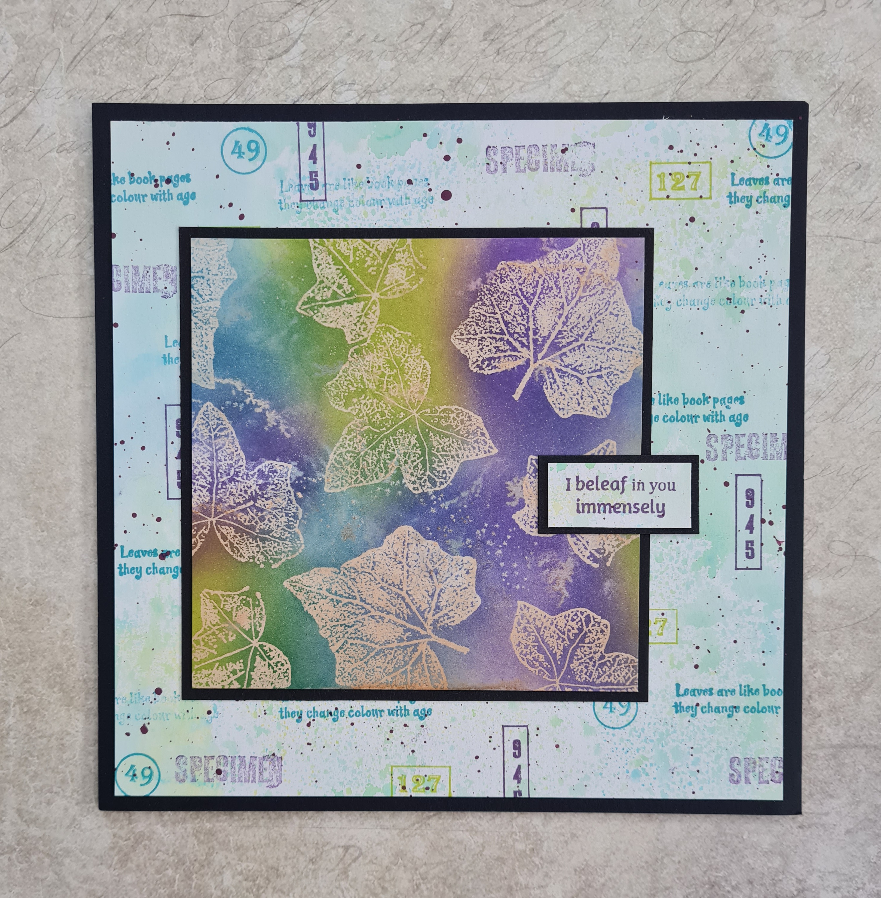
I am sharing an older example at this point that I had also made with the circle from the Shaded Baubles stamp set, using a butterfly and sentiment from Butterfly Perfumery. The background is once again sprayed with ink, and I stamped a splatter stamp from the Timeless stamp set using brown ink. I coloured the butterfly with Inktense pencils, and added a touch of brown shading to the circle background.I used a fineliner pen to draw a frame on the background.


A final Christmas sample that I made for last month was this brightly coloured tag card. I used a DL card base, and cut off the two top corners. I did the same for the piece of Drawing Cartridge. I coloured the background in shades of yellow, orange and purple, and added stamps from the Gold, Frankincense, Myrrh stamp set over the top. I stamped and embossed the main image from Kings of the Orient using gold embossing powder. I coloured the image using Zig clean colour markers.


This next card is a remake of an old favourite, but I found a much quicker, easier way to create the card. The first time around, it took me ages to make the card! I had decided to make the card as a TV demo, and needed to make the card quite quickly, so a bit of lateral thinking helped me devise a better way of making the design. I used some masking tissue to create the wavy hills, and these held the top spotlight piece of the card in place as I inked both pieces of the card, much easier than last time. I inked the main card in tones of grey, and the spotlight portion of the card in greens, and heather for the hills, adding blue for the sky, and a sun, using a circle mask. I used the folige from Floral Edges on both pieces of card, using grey ink for the main card, and green ink for the spotlight card. I added a sentiment from Amazing Mackintosh Words.


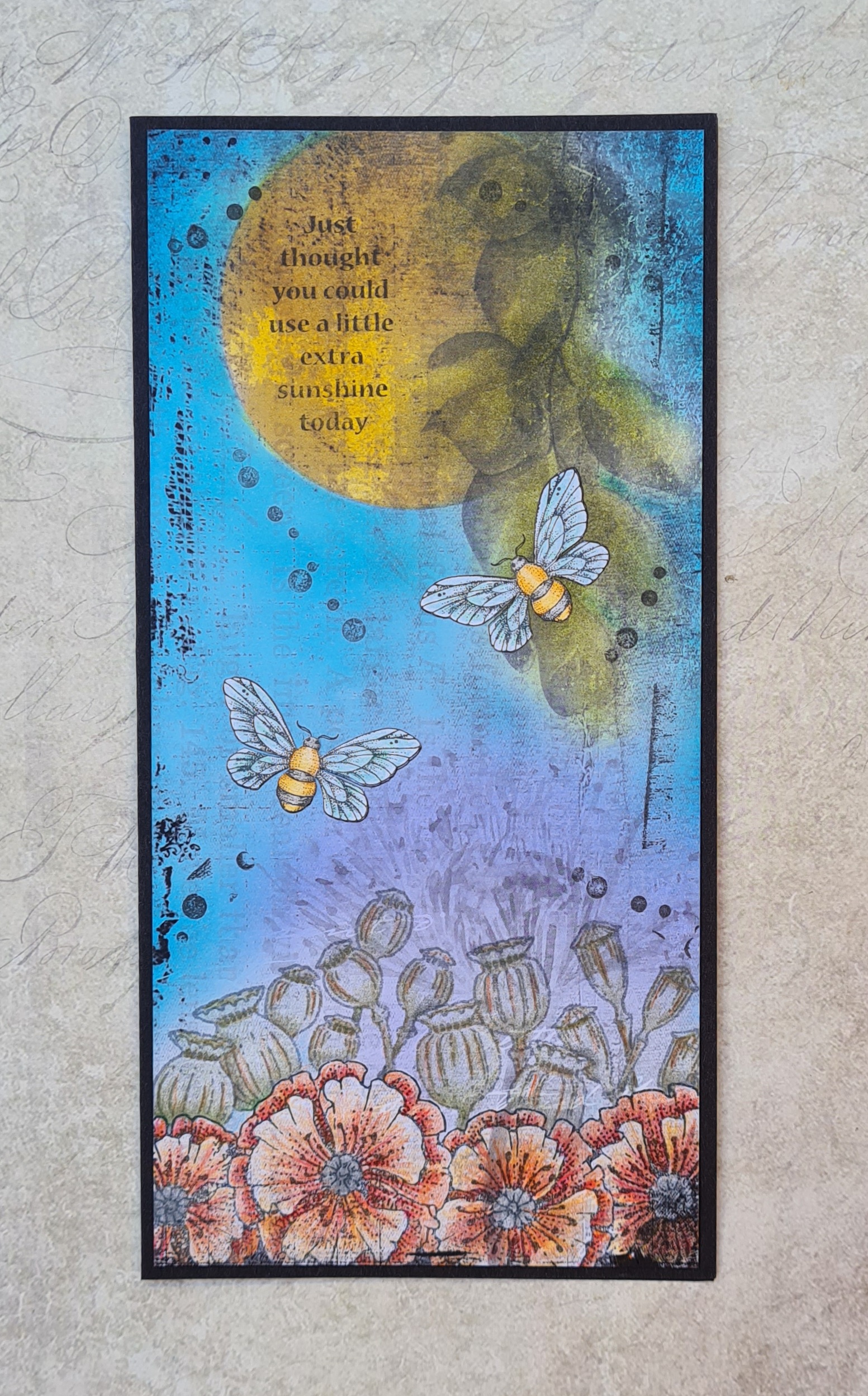
Another one of the edge stamp sets that we had on the TV shows was Poppy Edges, a beautiful stamp set, and I decided to combine this set with some of Lesley's black and white papers that we had on the TV show. I inked up the paper using Distress Ink and blending brushes. I stamped the big poppies at the bottom and masked them off, adding the poppy seed heads afterwards. I coloured these with pencils, and added a couple of bees, which I stamped on a separate piece of card and decoupaged. The sentiment comes from Loving Sentiments.


Now for a few golden oldies, this one uses the Decorative Edges stamp set, and the image is hand drawn by me.


These two are from Landscape Edges:


 This one is from Autumn Edges:


 Finally this one combines Floral Edges and Butterfly Dress:


Thanks for stopping by, I will be back very soon to share some projects from this month's TV shows. Take care, xx


Thursday 22 September 2022

End of an Era

Hello everyone, I hope that you are keeping well. Firstly, before I share my project for today, I have to announce that we will be bringing the Chocolate Baroque Design Team Blog to a close at the end of this month. The Design Team will no longer be posting on the blog, as we are finding that our vistor numbers are sadly dwindling, and the preference these days is for Facebook and Instagram. We have a dedicated Facebook Group which is very friendly, you can join and see lots of inspiration over there. The Design Team share their projects there too, and we are always dropping in to answer questions if you want to ask us anything. You can post pictures of projects you have made with Chocolate Baroque stamps, we would love to see them. We have an Instagram Page too, which is full of fabulous projects. You can give us a like, or leave a quick comment, we really appreciate a visit.

We would like to thank you for your support over the years, and appreciate all of your visits and comments. The Blog was created for you, our readers, and would not have kept going for so long without you.

I will still be posting regularly here on my own blog, and would love it if you still popped by to see me here. I will share my tips and projects as always each month here and on my own Instagram page @judithatpoppycottage

Now onto my project for today. I decided to create a panel using one of the long collage stamps from last month's TV show, stamped onto a serviette for this project. We often use patterned serviettes in our mixed media projects, and peel away the two or three layers behind, which get discarded or do not get used for anything. These plain layers are great for stamping on, and using just like their patterned counterparts.

I stamped the large The Phenomenal Butterfly Slim Strip image using Versafine Clair Nocturne and left it to dry for a few moments. Also using Versafine Clair Nocturne, I stamped some of the images from The Phenomenal Butterfly Elements and Out of the Trees Elements over the MDF panel, checking that they were in the area that would not be covered by the serviette once it was stuck down. 

I covered the reverse of the serviette with Matte Medium and adhered it to the panel. Now this worked fine twice at home, but in the studio, with the air conditioning blasting away, it was a completely different matter! The serviette was wafting about all over the place, and anyone who saw the show will have seen that I had a heart stopping couple of minutes while they turned the air con off and I attempted to lay the misbehaving serviette onto the MDF panel. Phew!

I gently brushed a bit more Matte Medium over the top, and this does take a very gentle touch, as too much can cause the serviette to disintegrate. I left the surface to dry completely before moving on to the next stage. I painted the image using transluscent paints in several colours. You could water your opaque paints down obviously, but I wanted to paint my colours neat, so this option worked for me. I chose a limited palette of colours.


I really like the unfinished MDF against the painted area, and hope that you will try this idea for yourselves.

Thanks for stopping by, xx


Saturday 10 September 2022

Dotty Strip Stamp

Hello everyone, I hope that you are keeping well. I have a couple of projects to share with you today showcasing stamps featured on last month's shows from Create and Craft.

I started my project with a large card blank, and drew along the opening edge using one of the Chocolate Baroque Draw and Tear Rulers Set 1 using a pencil. I cut the excess card away. On the inside of the card, I stamped the long dotty strip from Slim Word Strip 2 with a yellow dye based ink. I stamped a word strip from Slim Word Strip 1 over the top. I used one of the leaves from the From Nature 2 stamp set to stamp randomly over the front of the card using second generation stamping. I wanted a paler background because I did not want to detract from the other parts of the card.I added a splatter stamp from Timeless, using green and yellow ink.

I took a whiteboard heart and coloured it with the same yellow and green inks, and then stamped the same word strip as I had used along the card edge. I filled the heart, moving the strip across each time I stamped, to get a random compilation of the words. It looks great on one of these hearts. 


This card was fairly quick to complete, and I can see lots of possibilities for adapting the design to suit lots of occasions. Using the big word strips, especially now we have two sets for you to choose from gives lots of choices, and I hope that you will try out this idea, or a variation of the theme.

I decided to make another card featuring the dotty strip from the Slim Word Strip 2 stamp set. I stamped the strip onto a piece of Drawing Cartridge several times using shades of green and orange Distress Ink to create an ombre effect. I stamped the fruit tree from The Tree of Knowledge stamp set onto a piece of book paper, and coloured it with Zig Clean Colour markers. I added some shading around the edges using green Distress Ink. This card would be suitable for lots of occasions- a graduation, a book lover's birthday, or even just to show someone you are thinking about them.


 Thanks for stopping by, take care, xx


Thursday 8 September 2022

Leafy Bokeh Card

Hello everyone, I hope that you are keeping well. It's time for another monthly Fifteen Minute Card spot, and this month, I'm in a leafy mood. I have chosen to use the beautiful leaves from the From Nature 2 stamp set to create a quick Christmas card.

I stamped and embossed the leaves using a silver glittery embossing powder, and added a few snowflakes using white embossing powder. Keeping my background very speedy, I added shading with green and blue Distress Inks. I added some white circles with a stencil and Brilliance Ink for a bokeh effect. Finally, I added a sentiment from the Pears and Baubles stamp set. I love the font on this sentiment.

If you get the chance to make a quick card in Fifteen Minutes or less, then head over to the Chocolate Baroque Facebook Group where I have created an album for this month. You can pop your cards or other projects in there. We would love to see what you have made. Thanks for stopping by, 

Take care xx


Thursday 1 September 2022

Creating Stamps Using Leaves From The Garden

Hello everyone, I hope that you are keeping well. I have some cards to share with you today showcasing some of the wonderful stamps that we brought to the TV shows last month on Create and Craft. If you watched the shows, you will have heard the story behind some of these images, and how they came to be created. From Nature 1 was an incredibly beautiful stamp set, created from leaves collected around where David and Lesley work. I offered to send some leaves to Lesley from my garden in Norfolk, as I have some interesting leaves which are unusual, and would make fabulous stamps. So, I packed them up in resealable bags, and sent them to Lesley. The leaves were in pretty good shape when she received them, and therefore, From Nature 2 was created. I did craze Lesley to add a particular leaf to the stamp set, but they are all so versatile, and I had great fun creating my projects with them.

For my first card, I created a Distress Ink background and added a few extra paint splatters. I stamped some of the various words and sentiments over the top. I chose colours that would tone in with the focal part of my card, using Versafine Clair Inks. I used a small spare piece of this background card for a sentiment too.

To create my topper, I covered a piece of Drawing Cartridge with cold tea, and added sea salt to the background while it was still wet. I left the background to dry naturally, and then brushed the salt away. The salt leaves great markings on the background. I stamped and embossed the three sizes of ivy leaf onto the background. You can use clear or white embossing powder, it doesn't matter, although white embossing powder will enable you to see where you are embossing more easily. I then added Distress Ink all over the top of the background. 

I placed some copy paper over the background, and then ironed the embossing powder off the design. I kept checking that the embossing powder had all gone, replacing the piece of paper each time I checked. You can use brown paper if you prefer. By taking away the embossing powder, you get a completely flat surface, this is called a 'faux batik' effect, it looks like the batik material that originates from Indonesia, which is created by using wax as a resist when dyeing fabric. I also felt that by using the tea dye behind the Distress Ink, the irregularities looked like the background had been sun bleached, as if I had created a cyanotype effect. 

I used blue inks on another piece to really highlight this effect.

My second project features the stunning Plume Poppy leaf, or Macleaya Cordata if you prefer the latin name. I used an actual leaf to create the background, using a technique that my lovely friend Elaine, an ex Chocolate Baroque Design Team member, taught me. To create the topper, I simply stamped and embossed the leaf, and added colour using Distress Inks, water and a brush. A few splatters of brown ink, and one of the smaller stamps from the set complete the design.


For my final card, I chose to use the Smoke Bush or Cotinus leaves, there are two on the stamp set. I arranged them in clusters, just as you would see them on the bush, and coloured them with pencils. For the larger background, I simply stamped them with a plum coloured ink. Both backgrounds are simple Distress Ink backgrounds, and I have edged both layers with a plum coloured ink to avoid using extra card to mat and layer.

I hope that you have enjoyed the story behind these stamps and will try out some of the ideas that I have shared with you. I will be back later in the month to share more leafy projects with you. Thanks so much for stopping by, take care, xx


Tuesday 23 August 2022

A Touch of Pink

Hello everyone, I hope that you are keeping well. I have a project to share with you today showcasing some of the products featured on last month's TV shows on Create and Craft. 

To create my project, I started with one of the fabulous black and white papers designed by Lesley. I attached this to a MDF panel using matte medium. I stamped the large flourish from Butterfly Daisy Collage in two of the corners, and added the Small Graph Paper randomly stamped using a pink Versafine Clair ink. I just used parts of the stamp to give a patchy effect, and used the stamp held in my hand, rather than on a block. I added Distress Ink around the edges with a blending brush.

I stamped and embossed the Freedom Flower twice onto a spare piece of the black and white paper and cut it out. I coloured the image with shimmer paints, before decoupaging the flower and attaching it to the background. I used a grey pencil around some of the petals to give the impression of extra layers, adding shading for more depth.

Thanks for stopping by, Take care, xx


Wednesday 17 August 2022

Launching Fifteen Minute Cards Again!

Hello everyone, I hope that you are keeping well. I am sharing a few projects to launch an old favourite on the Chocolate Baroque Facebook Group and also on Instagram today. I used to run the Chocolate Baroque Colour Challenge Blog, and a regular monthly feature was the Fifteen Minute Card feature. Myself and the Design Team used to create cards in fifteen minutes or less using stamps from Chocolate Baroque. We used up scraps from our stash, or made clean and simple cards, any style of card was achievable really, but this style of card was great for batch cards, craft fairs, Christmas cards, Wedding Invitations, etc. If you needed a card in a hurry, or wanted to make a quick card or two for your collection, being able to make a card in fifteen minutes is such a good idea. It's great for beginners too, as you do not need to make anything complicated, and can try out lots of ideas quickly.

I am sharing lots of familiar ideas in this post, and I will be creating a post once a month, roughly around the middle of the month. I won't post on exactly the same day, life gets in the way; holidays, and other commitments, but I will always share what I have made, and let you know where you can post your projects if you would like to create along with me and the Chocolate Baroque family. I hope that you will enjoy yourselves, just playing with your stamps and materials for fun. After all, hopefully we can all spare fifteen mintes every now and then!

For my first two cards, I created backgrounds using an acrylic block. I added Distress Ink to the block for my card, and spritzed it with water. I placed the block onto a square piece of Drawing Cartridge, pressing down all over the block. I peeled the block away and left the background to dry. (I created several backgrounds all at the same time while I was doing this background, and so I timed myself for four cards in an hour). I could have dried the background of with a heat gun, but it would have faded the background colours a bit.

Once the background was dry, I stamped the tree from Fantasy Woodland onto the background. I added foliage from Silhouette Grasses along the bottom, and a sentiment from the From Nature 2 stamp set randomly over the background. I coloured the tree with Koh-I-Noor pencils, just using two colours for the fruit, and two colours for the leaves. It was really quick, and took me just a couple of minutes. I trimmed the panel and edged it with green ink before attaching to to a piece of linen card.

For the second card, I used Distress Oxides on the acrylic block, creating a background as before. I chose a selection of stamps from the Silhouette Grasses stamp set, and using Versafine Clair Ink, I created a meadow scene. I added a sentiment from Words to Dazzle and Sparkle.

My third card was stamped directly onto a card blank, and was so quick to make. I used a circular gelli plate, and added Distress Ink to the plate before 'stamping' this onto the card blank. I stamped two dragonflies from The Phenomenal Butterfly Elements stamp set onto the card, and masked them, before adding a couple of script rings from the same stamp set. I masked these as well, and then added a couple more stamps to complete the collage effect. I removed the masks and coloured in the dragonflies and script rings with pencils. The coloured circles are from the Floral Paraphernalia Elements stamp set.


My final card was created by using a piece of patterned paper. Lots of the work is already done for you when using patterned papers, but you can add so much detail over the top. We all have bits and pieces lurking in our stash, don't we? I stamped the beautiful dandelion clock from Not More Flowers! and added elements from Making More Marks, all using Archival Ink.


I hope you have enjoyed my selection of cards this month, and that you will join in making a few quick cards yourself. Head over to the Chocolate Baroque Facebook Group, where I have created an album, look for Media at the top of the page and search for the August 2022 Fifteen Minute Cards Album. Alternatively, head over to Instagram, and upload your cards with the hashtag #chocolatebaroquefifteenminutecards

Take care, and thanks so much for stopping by,


xx


Friday 12 August 2022

Scaling Up Those Little Projects

Hello everyone, I hope that you are keeping well. I have a few projects to share with you from last month's TV show on Create and Craft, showcasing some of the beautiful floral butterfly stamps that we had on the show. 

I like to make a few quick cards when I can, they are so handy to have in my stash when I need a card in a hurry. I also like to make a batch of them, several at a time, so that I can give them as a gift, or just to build up a store of cards to use later. I love to make little 4" x 4" cards, they are a lovely size to create and to give as gifts. I created two different types as demos on the show last month, and here is how I created them:

The first card was created using a piece of Drawing Cartridge just slightly smaller than 4" x 4". I swiped some Distress Oxide Ink onto an acrylic block, (green and blue), and spritzed it with water. I placed the Drawing Cartridge onto the block, and then peeled it away, to get a watercoloured background. I left the background to dry naturally. I stamped the daisy image from Honeysuckle Butterfly twice onto the background, using black ink, and added a butterfly. I also added some foliage from the same stamp set using green ink in first and second generation stamping, to give the impression of a field of flowers. I varied the height of the foliage. I coloured the flowers and butterfly with Koh-I-Noor pencils, using a simple palette of pink, yellow and green. I edged the background with turquoise ink.

To create my second quick card, I selected a piece of black and white paper created by Lesley, which I cut down to size. I added sponging with green and purple inks to create hills, and pink or orange ink around a circle mask to create the impression of a sun, (a technique that was inspired by the lovely Jean Hardy). I used Versafine Clair ink in various colours to stamp foliage from the stamp sets, and added a butterfly which I coloured in co-ordinating colours.

These little cards are lovely in their own right, but I wanted to show you that they could also be used as larger cards too. I created backgrounds for both of these cards very quickly using the butterfly on the card to pull everything together. For the first card, I used the blue and green ink as before to create a Distress Oxide Ink background, as you have seen me create so many times before, and then I simply stamped the butterfly randomly over the top in turquoise and green ink. I edged the background in the turquoise ink as I had done with the smaller card. It makes a really pretty large card suitable for any occasion, just add a suitable sentiment, or leave it blank and add a sentiment inside.


 For the second card, I used a piece of grey card, and added the butterfly stamped with pink and orange Versafine Clair, it's an unusual colour combination, but really pretty, just the same.


 I hope that I have given you lots of ideas for these lovely stamps, thanks so much for stopping by,


Take care, xx


Monday 1 August 2022

A Pop of Colour

Hello everyone, I hope that you are keeping well. I have a project to share with you showcasing stamps from last month's TV shows on Create and Craft. This was one of the demos that I created on the show, and I really enjoyed putting this project together.

I started my card by colouring a piece of Drawing Cartridge with Distress Oxide Ink, I chose a blue and green ink. I placed it onto a craft mat, and spritzed some water onto the ink, before placing the Drawing Cartridge over the top. I dried the Drawing Cartridge, and then patted it onto the mat again, to pick up some of the left over ink. I dried the Drawing Cartridge once more and continued with the background.

I added some stencilling using orange Distress Oxide Ink. I also stamped the Small Graph Paper stamp using green Versafine Clair ink, simply holding the stamp in my hand, not on a block. This gave me the opportunity to use random parts of the stamp by curving the stamp, so that only a portion of the stamp touched the background. I used a definition from the F is for... stamp set to complete the background.

I stamped and embossed some flowers and a butterfly from the Butterfly Daisy Collage stamp set onto some patterned paper. I coloured the images with Koh-I-Noor pencils and cut them out. I used the large flourish, and stamped the ends on the background, working out roughly where they needed to go by placing my flowers down first without adhering them. I stamped the butterfly antennae where I wanted to place the butterly on the background before I stuck the butterfly to the background. I curved the flower petals with my hands, but you could use a pencil or scissors to do this. I attached them to the card in between the flourish ends, and added some black buttons in the centres. I matted the background onto black card for extra drama to finish.

I will be back later in the month with more projects to share with you, thanks so much for stopping by.

Take care, xx


Friday 22 July 2022

One Stamp Two Ways

Hello everyone, I hope that you are keeping well. I have a couple of projects to share with you today showcasing some of the retired stamps that we brought to the TV shows on Create and Craft last month.

I always love to show the versatility of a stamp and this lovely leafy stamp from Brocade Backgrounds, an all time favourite of mine, is no exception, I have used it a lot over the years. You can find plenty of fabulous stamps in the current range of Chocolate Baroque stamps that would work equally as well for these techniques.

For my first card, I used a piece of grey card, and stamped the leaf using black ink all over the background. I used Koh-I-Noor colouring pencils to colour the images, and added a touch of green ink around the edge of the card. I added a sentiment from Amazing Mackintosh Words and a piece of green velvet ribbon to finish.

For my second card, I stamped the leafy image with Versamark and clear embossing powder over a piece of Drawing Cartridge before colouring the background with Distress Ink. I covered the background with paper and ironed off the embossing powder, creating a faux batik finish. I then stamped the second image over the top using a dark blue Versfine Clair ink. I added a sentiment from another of the retiring sets.


I have thoroughly enjoyed revisiting some of these old favourites, but there are so many more exciting things to come! Thanks so much for stopping by, take care, xx


Sunday 10 July 2022

Making Your Scrap Papers Work For You

Hello everyone, I hope that you are keeping well. I have a couple of projects to share with you showcasing some of the retired stamps that we brought to the TV shows on Create and Craft last month. The TV shows were so busy, and if you were watching, you would have seen that we had to change our demos, sometimes in the middle of what we were doing, it certainly made us think on our feet! 

I wanted to share two of the projects that I talked about during the shows, although one you did not see in its completed version, I made a different version on the show due to sellouts of the stamps that I had planned to use.

Often we have bits of card and paper in our scrap boxes that do not seem to go together, a piece of card left over from a crafting session that is blue and purple, and a piece of brown card. Whatever would make them work in a project together? 

I like to mix and match my scraps together, and can easily put these pieces with each other by using toning inks. I used the piece of tea dyed card as the large background, stamping a small worker stamp randomly all over using various shades of blue and purple, then edging the card with a blue ink. I then stamped a large flower three times onto the blue/purple card using purple Versafine Clair ink and clear embossing powder. I cut the flowers out and adhered them to the background, adding a piece of scrap corrugated card underneath the third one to raise it up slightly. I can add a sentiment at a later date when I know what the card will be used for.


My second project was created by taking a piece of greyboard and painting it with white paint. I added torn strips of book paper and then painted the whole piece with acrylic paint. I chose a pretty green paint, and some touches of plum around the edges. The green paint allowed the book pages to still be seen, as it was not completely opaque. I added some stencilling with Plum Archival Ink, and stamped a pretty leafy sprig from one of the retiring stamp sets, Take It or Leaf It.

I chose some patterned papers to stamp and emboss birds from Sing Your Song, Live Out Loud, and Fly Away With Me. I added a bit of colour using Distress Inks and a blending brush to make the papers fit my colour scheme. I also had some left over card from another project, which had originally been blue and green. It did not match my colour scheme, but I had some of the plum paint from this project on my craft mat, so I spritzed it with water, and splattered it over the card, to tone the card in with this project.


A very simple way to get the card to match. I then stamped the sentiment onto a die cut piece of the card, and sponged some of the Plum Archival Ink around the edges. Finally, I attached the birds to the leafy branches, and attached the sentiment to the panel.

Thanks so much for stopping by, I will be back later in the month with more projects to share.


Take care, xx


Related Posts Plugin for WordPress, Blogger...