Followers

Tuesday 30 May 2017

Woodland Fairy

Hello everyone, I have a Fairy project to share with you today, and have combined lots of different stamp sets to create a little scene using pencils and Pan Pastels.

I have created my project using Pan Pastels for the background, adding stamps from the Fantasy Castle stamp set initially in the back of the picture, and then I added images from the Design a Tree collection to create a forest effect. I used coloured ink to add the little flowers to the trees, and a deeper shade of Pan Pastel, with a touch of grey pencil to ground the trees, so that they did not float in mid air. I stamped the clouds with grey ink for a softer finish, and added pale pink Pan Pastel and white charcoal to create fluffy appearance.

I stamped the fairy from the Spring Fairy collection onto a separate piece of card, and coloured the image with Polychromos pencils, before cutting it out and adhering it to the background. The castle in the background was also coloured with pencils.


Thanks for stopping by, xx

Wednesday 24 May 2017

Purple and Green

I have a card to share as part of the Chocolate Baroque Colour Challenge Blog inspiration today. It's the final month that we are running a challenge, and we hope that you can find time to come and visit before we finish for good.

I have made a card using an image from the Mellow Fruitfulness stamp set, embossed with gold embossing powder. I also added two butterflies from the Spring Fairy collection. I masked the images, and added a background coloured with Distress Inks. Once the background was dry, I added the Large Crackle Background around the edge, and some extra shading, with more Distress Inks.

I coloured the images with water based markers, and added a sentiment from the Words to Dazzle and Sparkle stamp set.


Thanks for stopping by, xx

Thursday 18 May 2017

Buddha Birthday Card

It's not often that I get a chance to post something that is not Design Team related, but today is one of those days. I have been attending yoga classes for several months now. It started as a means of getting fit, but as soon as I went to my first class, I knew that I had found something that just felt right. I feel very calm and peaceful at the classes, even though our teacher, Niki, makes us work really hard! We seem to achieve the perfect balance of relaxation and exercise from her classes. She is a lovely warm individual, who calls us her 'yoga family', and just makes everyone feel so welcome. My Daughter also attends one class a week with me, and it is lovely to go through the class alongside her each week.

It is Niki's Birthday next week, she does not follow my blog, but she will already have her card by the time this post goes live. I wanted to make a card that was suitable for her, and her main pastime- yoga. I chose to use a lovely Buddha image from Inkylicious, which I stamped and masked, before adding some stencilling to the background. I added some extra graduated colour, all using Distress Oxide Inks, and then spritzed the background with water.

I coloured the image with Zig Clean Colur markers and a water brush, giving the image a warm stone effect, by using a mix of pink and grey. I then added a sentiment from Inkylicious, which I feel is perfect for Niki, as she brings sunshine to so many people.


Thanks for stopping by, xx


Little Flowers

Hello everyone,  I have created a couple of floral projects for your inspiration, using stamps from the Spring Fairy Collection stamp set. I like to use the often overlooked smaller stamps from a stamp plate to create all occasion cards, and these cards are no exception.

For my first card, I used the same stamp to create both the background, and main image for the card. I stamped the image using Versamark and white embossing powder randomly over a kraft background, and then heat set the images with a heat gun. I coloured the images with Zig Clean Colour markers and a water brush.

I stamped the main image onto a piece of die cut smooth watercolour paper, inking the egdes of the background with Distress Ink whilst the die was still in place, so that there would be a white border around the oval. I coloured the image with Zig Clean Colour markers. I punched two holes through the oval, and threaded the ribbn through the holes from the back, so that I could tie a bow at the front. I left two longer pieces behind the card, which I adhered to the kraft background, as I stuck the main image down. I coloured the ribbon with Squeezed Lemonade Distress Ink and water, so that I had a good match to the colours that I had used in my project.

 You might have seen this card on the April TV shows on Hochanda:


For my second card, I cut a strip of smooth watercolour card, and coloured it using Seedless Preserves, Picked Raspberry and Spiced Marmalade Distress Inks, blending them where they met. I stamped the flower image, using Versafine Onyx Black Ink, graduating the height of the flower across the background. I added a couple of butterflies from the same stamp set, and a sentiment from the Words to Dazzle and Sparkle stamp set. Finally, I mounted the background onto a black card blank.

This was a really quick card to make, but just great when you need a colourful card in a hurry.

Thanks for stopping by, xx


Monday 15 May 2017

Another Fifteen Minute Card

Hello everyone, it's time for another epic blog post over on the Chocolate Baroque Design Team Blog, featuring cards made by the Design Team, that take fifteen minutes or less to create. This monthly feature shows how the lovely stamps from Chocolate Baroque can be used to create simple cards in a flash, as well as the more elaborate cards often produced for the Design Team Blog. We want to share quick ideas for beginners, or for those of you who need cards in a hurry. Maybe you want to make a batch card for Christmas, a wedding, or perhaps you need ideas for a craft stall even, that do not take hours to create.

I have made a simple little card as part of the blog post, using a gelli plate to create a background. I brayered two colours of Distress Ink onto a smaller gelli plate, (the 3" x 5" plate), and then pressed some bubble wrap onto the plate to create a pattern. I stamped the gelli plate onto a white card blank, like a stamp.

I stamped the bird from the Spring Fairy Collection stamp set onto the background, adding some coloured detail with Polychromos pencils. Finally, I added a sentiment from the Words of Wisdom stamp set.


Changing the words on this card could make it suitable for so many occasions, both masculine and feminine. It was a really quick card to make, and I hope that it has given you a few ideas to make some cards of your own. Do check out the rest of the blog post on the Design Team Blog, and see the fabulous projects from my Design Team mates.

Thanks for stopping by, xx

Wednesday 10 May 2017

Sunset Sky

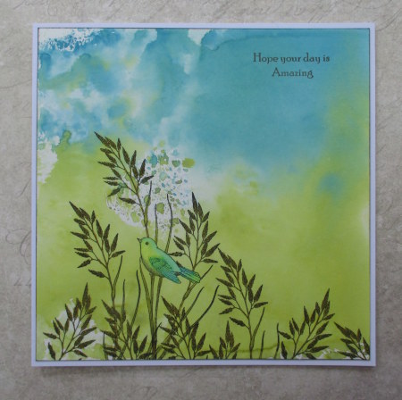
Hello everyone, it's the final week of the current Colour Challenge, over on the Chocolate Baroque Challenge Blog. I am adding my own piece of inspiration to the blog this week in the form of a card. I always enjoy making cards for the Challenge when I have the time, as it gives me an opportunity to use often forgotten or unused stamps to create a project. I have a vast collection of Chocolate Baroque stamps, having been a fan for many years, and on the Design Team for a loooong time as well.

I have chosen a bird theme for my card, and decided that a sunset would be perfect using these colours. I cut a small piece of hot pressed watercolour card, and created a wash over the card, masking off a circle for the sun. I used the turquoise at the top, and the red at the bottom, which became more pink as it was diluted. I used water based markers, scribbled onto my craft mat to create the wash, and a large paintbrush, spritzing extra water on the mat, to get a watery effect.

I removed the circle, and coloured in the sun, using a yellow marker, then added streaks of red to give the sunset effect. I also added some white charcoal, blending it slightly, to give an airy feeling to the sky.

I stamped the silhouette image from the Let Your Heart Sing stamp set, using Potting Soil Archival Ink, and added some brown pen, to ground the image. I diluted the pen slightly with a water brush.

I created the larger background by blending Broken China, Fired Brick and Fossilized Amber Distress Oxide Inks over a larger piece of watercolour paper, and spritzing them with water, before drying with a heat gun. I edged both backgrounds with the brown Archival Ink, and attached the smaller background to the larger one, before stamping the sentiment from the Fly Away with Me stamp set. I attached the background to a large kraft card blank.

There is still plenty of time to enter the Colour Challenge, so do pop over to the blog, and see the inspiration provided by my Team Mates. This week, we are also taking a look at some of the fabulous entries we have received so far.

Thanks for stopping by, xx

Saturday 6 May 2017

Distress Ink Cards

Hello everyone, I have two cards to share with you today, showcasing the Spring Fairy Collection stamp plates, which were featured on the recent TV Shows on Hochanda. My cards both started off in the same way, with a Distress Oxide Ink background, and I then chose which stamps I wanted to use to complete the cards.

For the first card, I decided to create a very clean and simple style card, choosing fresh blues and greens for the background. I stamped the little bird image onto the card, using Potting Shed Archival Ink, and then I masked the bird itself, before adding extra stamping using the foliage part of the same stamp repeatedly across the bottom of the card.

I added some colour to the images with Zig Clean Colour markers. I added a sentiment from the Words to Dazzle and Sparkle stamp set, using the same ink as before, and edged the background with the ink as well, before adhering the background to a large card blank. I love this little bird stamp, it can be used for so many different occasions, and is great for masculine cards as well.

For my second card, I chose a selection of images from the Spring Foliage, and Silhouette Grasses stamp plates, and using a selection of ink colours, I built up a scene on my Distress Ink background. I stuck to a palette of greens and purples, creating a tone on tone effect. I added a silhouette fairy and butterfly from the Spring Fairy Collection, plus the large 'Spring' from the stamp plate. Finally, I added some sparkle to the wings using a clear Wink of Stella pen.

Thanks for stopping by, xx

Related Posts Plugin for WordPress, Blogger...