Followers

Monday 31 October 2016

Using up those Scraps

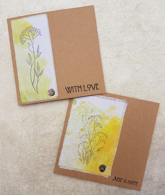
Hello everyone, I am sharing a couple of cards that form part of the Fifteen Minute Blog post found on the Design Team Blog today. Our aim is to create cards that can be made in fifteen minutes or less, using a variety of Chocolate Baroque stamps. The cards may be clean and simple in design, or simply quick and easy to make. You can find a whole host of inspiration in the blog posts, and the Design Team contribute as a group, so you will see a real mix of styles and techniques.

For my cards today, I am using some fabric scraps left over from my recent journal pages. The fabric had been coloured with Distress re-inkers, and then dried completely. I used Fossilized Amber for one piece, and Shabby Shutters for the other piece. I stamped a simple floral image from the Essence of Nature and Autumn Fairy Collection stamp sets on the scraps, using Black Archival Ink, and then frayed the edges of the fabric.

I used iron on interfacing on the reverse of the fabric to attach it to the card blank, and then attached a little pearl button to the panel. I stamped a greeting from the Mackintosh Sentiments stamp set on each card to finish.

Thanks for stopping by, xx

Saturday 29 October 2016

Autumn Journal Pages

Hello everyone, I have a final Autumn project to share with you this month, and decided to mix up some of my old favourite stamps to create a couple of pages in my Pink Pig journal. I created these pages using lightweight cotton fabric and used iron on interfacing to attach the pieces to my journal pages.

I coloured the fabric with Distress re-inkers, I chose Ripe Persimmon, Shabby Shutters and Fossilized Amber. I created lots of fabric, and then worked out which images I wanted to use as my main focal images, stamping these in Black Archival Ink. When stamping on fabric, you do not need to press extra hard, just allow a bit more time for the ink to settle onto the fabric.

Once I had stamped all of the main images, I added some background stamping to the larger pieces of fabric, using Sepia, Plum, Olive and Potting Soil Archival Ink. Although some of the background images are different, I used some co-ordinating images to tie the pages together. I frayed the edges of the fabric before adding the interfacing, as it is much harder to do this afterwards.
I love the texture of fabric and when I am working with it, I often wonder why I don't create more projects in this way! Here are some close ups of each page:

 
I  have chosen lots of Autumnal stamps from my favourite sets: Autumn Poppy, Essence of Nature, Nature's Peace, Autumn Fairy Collection, Words of Wisdom, Woodland Design a Tree, and used rich, warm colours that remind me of the season. Although I have created journal pages here, you could easily use the general design that I have created to make cards, and they would suit both men and women, with these rustic colours.

Thanks for stopping by, xx

Wednesday 19 October 2016

Sending Love and Best Wishes

Hello everyone, it's the start of a brand new challenge over on the Chocolate Baroque Challenge Blog this week, and the colours are bold and bright, lovely blues and greens. I always remember that old adage my Mum used to tell me.....blues and green, must never be seen....but I love working with them together.

Anyway, I rummaged through my scrap box again, and found this lovely background, made when I was experimenting with my Golden paints ages ago, and it suited the colour scheme perfectly. I stamped the Swirl Centre Flowerhead, and some leaves from the Diamante Delights stamp set onto a spare piece of watercolour paper, usding Versamark and Wow brass embossing powder. I coloured the images in using Zig Clean Colour marker pens and cut the images out. I die cut a circle of card, and coloured it using Squeezed Lemonade Distress Ink. I stamped over the top using an image from the Texture Fragments stamp set and Salty Ocean Distress Ink.

I assembled the card, adding a dark layer of card to mat my layers, and adhered the leaves and flowers around the edge of the circle.


Thanks for stopping by, xx

Monday 17 October 2016

Autumn Mushrooms

Hello everyone, I have another Autumnal project to share with you, and I have been playing with those zingy Brusho colours again. I created a background using a combination of Gamboge, Lime Green and Orange, which I spritzed, and blotted with a spare piece of card. I then stamped an image from the Autumn Poppy stamp set randomly around the edge of the background, using Plum, Olive and Sepia Archival Ink.

I cut a smaller piece of card, and stamped and embossed the central image, using Wow copper embossing powder. I coloured the image using Brushos and a water brush. I edged the card using Fossilized Amber Distress Ink, and chose another leafy image from the stamp plate and the same Distress Ink, to stamp around the edges.

I edged both pieces of card with Mowed Lawn Distress Ink, before adhering them to a card blank, onto which I had added a piece of pale green card.

I will be back later in the month with another Autumn-themed project to share with you. Thanks for stopping by, xx

Saturday 15 October 2016

Speedy Birthday Card

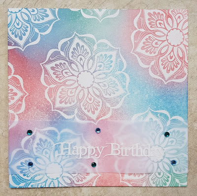
Hello everyone, I have a speedy card to share with you today, part of a larger blog post over on the Design Team blog that features quick cards that take no longer than fifteen minutes to make. We run this feature twice a month and hope to demonstrate how versatile Chocolate Baroque stamps can be for those cards in a hurry, for batch cards, or when you do not want to make a really complicated, multi-layered card, that takes hours on end.

I chose to use one of the Baroque Ornament stamps, which is a really good size, and stamped and embossed the image randomoly all over the background, using Versamark and white embossing powder. I like to use Wow embossing powder, I find that it is the best I have come across for giving a great impression. I used three different colours of Distress Ink to blend across the background, and decided not to be conventional with my colour choice this time, I was going to go safe and choose a pretty violet to add to my blue and green, but I picked a random salmon to add into the mix, just for a change!

Once I had blended the background, I spritzed some water over the background, left it a few seconds, and blotted some of the water away, for a mottled effect. I embossed a sentiment onto a strip of vellum, and then added some gems to finish.

I can see this being a great store cupboard card, and fancy making a few more colour ways and trying a gold embossed version with some more vibrant backgrounds too. Thanks for stopping by, xx


Wednesday 12 October 2016

Rainy Day Blues

Hello everyone, it's the final week of the current colour challenge on the Chocolate Baroque Challenge Blog. The colour scheme is a monochrome scheme, blues and teals, and perhaps it has been a bit more difficult than some for everyone to use, as we have had less entries than normal. I have created another card to provide a bit more inspiration perhaps, and maybe help you come up with some ideas for a project to enter into the challenge. As we have had so few entries involving Chocolate Baroque stamps this month, there is a really good chance that you could win the prize by taking part. So all I can say is, why not have a go, you never know, you might be lucky!

I have had the idea for this card rumbling around in my head ever since the Seasonal Fragments stamp set was released, but just never got around to making it. I stamped and embossed the raindrops image several times around the edge of the card using seafoam embossing powder. I then covered the card using Salty Ocean Distress Ink, leaving a paler area in the middle. I stamped the sentiment from the Loving Sentiments stamp set using Nautical Blue Memento Ink.

I stamped the top part of the large sail boat from the Steampunkery stamp set onto a pretty blue scrapbook paper from Crafty Individuals and cut out the section that I needed. (I used five images). I stuck the images down and trimmed the excess off, and then added the spare pieces to the edges of the background. I then drew umbrella handles with a fine-tipped marker pen. Finally, I edged the background with the Nautical Blue ink, before adhering it to a white card blank.


Thanks for stopping by, xx

Thursday 6 October 2016

Nature's Peace

Hello everyone, I love this time of year, when the countryside is filled with warm colours, and the leaves are turning shades of orange, brown, gold and plum.We still have plenty of warm sunshine to enjoy the changing season, and it really is a time to marvel at the natural colour palette all around us.

I have created a card using some left over pieces of watercolour card from a previous project. I had created a Brusho background, and used these pieces of watercolour paper to blot the originals. I simply added some stencilling and stamping to the top layer, and then added some shading around the edges of the layers, using Seedless Preserves Distress Ink, to add a warm plummy tone to the background.

I have used a lovely tree from the Nature's Peace stamp set, which I inked with Distress Markers, enabling me to incorporate the various colours that I had used in my background. I also stamped around the edge of the background using a favourite tree from the Fantasy Woodland stamp set. I used Seedless Preserves and Shabby Shutters Distress Ink to add the leafy pattern.

This really was a quck and easy card to make, and by varying the colours, could become a very masculine card.
Thanks for stopping by, xx

Related Posts Plugin for WordPress, Blogger...