Followers

Monday 30 May 2016

More TV Show samples

Hello everyone, I hope that you have been tuning in to Lesley's and Dawn Bibby's recent TV shows on the Craft Channel. They have been showcasing the Chocolate Baroque stamps superbly, and the demos have been absolutely fantastic. It has been great to see some of our older stamps getting an update using newer products, and I have thoroughly enjoyed using them again.

Lots of my DT projects have been having another airing, which has been great. I made several of them ages ago, and it is lovely to see them still giving inspiration to people. You can check out my Pinterest board here: https://uk.pinterest.com/judithsmith45/my-own-cards-and-projects/ if you care to scroll through, you will see lots of the cards featured on the various shows, but I thought that I would share a few with you.

Dawn saw this card on a recent show featuring the texture stamps, and instantly fell in love with the peacock stamps:
My other texture samples at the time were these: A tag using the Fancy Flowers stamp set
 A canvas created using acetate for the central window motif and dimensional flower embellishments.
 A mixed media piece using scrap cardboard as the base, fabric for the stamping, and acetate for the bird cages.
The peacock related show showcased a lot of my samples, and I remebered having a lot of fun creating these:

I used sari waste as part of the tail on this peacock, showing how you can use elements from the stamp plate to design your own bird.

I always love to mix and match the stamps that I have, and using the bodices from one of the haberdashery stamp sets, gave me a chance to be a dress designer for a day!

I have had a lot of fun using my gelli plate to create new samples for some of the shows, and the following cards show a cleaner style than some of my older cards, offering inspiration to make cards in a shorter amount of time. We don't always have hours to create something special, but want something that is nonetheless a little bit different:


Finally, a round up of a few more examples that were created for the shows, both old and new that you may have caught along the way:


This card was created using a sentiment and flourish from the Artistic Expressions stamp plate:


I hope that you have enjoyed my gathering of projects, and do please keep looking out for more shows coming up on the craft channel with Lesley and Dawn, showcasing the stamps from Chocolate Baroque. You never know, you might see something else that I have created ;) Thanks for stopping by, xx

Wednesday 25 May 2016

Woodland Scene

Hello everyone, it's Winner's Week on the Chocolate Baroque Challenge Blog this weeik, and I am providing another nspirational card as part of The Design Team.

I have chosen to use the Design a Tree stamp sets, as we have been using those recently to create samples for one of Lesley's television shows on the Craft Channel, and they were still out on my craft desk.

I created a background on a smooth white card blank, using green and blue Distress Inks. I masked off the edges first, using low tack masking tape, and took away some of the stickiness, by pressing the tape against my clothing. I used brushes to apply the ink, and blended the inks together where they met in the middle of the card. I used a stencil across the top of the background, and applied Squeezed Lemonade Distress Ink through the stencil. The stencil was slightly smaller than my card, and so I just moved it along at the edges, using the co-ordinating Distress Marker to add extra detail through the stencil where necessary.

I stamped the central, larger tree using Vesafine Onyx Black Ink, and added the smaller tree either side, using Versafine Smoky Gray Ink, taking care to offset them a bit. I picked up a bit of Pumice Stone Distress Ink with a painbrush and dry brushed it under each tree to add some shading. I chose several shades of lilac and purple ink to stamp the foliage of the trees, starting with the lightest first, and using second generation stamping for the trees at the back of the picture, to help create the feeling of distance for those trees at all times. I added another foliage stamp at the base of the picture, to resemble flowers on the ground, adding in some green stamping as well, which looks like grass, again, fading to second generation stamping the higher up the background I went, to indicate a move further back in the woodland. Finally, I added a sentiment from the Words of Inspiration stamp set. I have cut this stamp in half, giving me the option of having it as a long stamp, or as I have stamped it on this card.


I hope that you will hop over to the challenge blog to see more Design Team inspiration, and check out how you can join in the current challenge. Thanks for stopping by, xx


Monday 23 May 2016

Fritillary Flowers

Hello everyone, I have a card to share with you today using a selection of some stamps that I have had in my stash for a little while. Sometimes it is great to look at your stamps with a fresh viewpoint, and try using them in different ways. I have always used the Snake's Head Fritillary stamped individually as a focal point on a card, but wanted to create a meadow effect with the flowers for this particular card.

I started to create the card by stamping a few of the flower heads in Onyx Black Versafine Ink, and masking them as I went along. If they were higher up the card, I ensured that I did not stamp the end of the stalk, so that I could draw a longer stem  freehand afterwards, using a fine tipped marker pen. Once I had stamped five images, I switched to Smokey Gray Versafine Ink, and stamped the remainder of the images.  I wanted to give the feeling of depth to the flowers, and the grey ink helped some of them appear to fade into the background, as if I were creating multiple layers of flowers.

I coloured the flowers with Polychromos pencils, adding grey pencil to the flowers at the 'back' of the picture, to tone down the colours a bit. I also used much paler colouring for these flowers, making the flowers in the foreground much more vibrant.

I used Distress Ink to colour the background, and added some stencilling, using the same colours of Distress Ink to keep a layered look to the background. I stamped a couple of butterflies from the Harebell and Thistle butterfly stamp sets directly onto the background, and then stamped the images again onto some spare card. I coloured these images with pencil before cutting them out, and decouoaging them onto the background. I added a greeting from the Birthday Words stamp set, and mounted the background onto a large black card blank.

Thanks for stopping by, xx

Friday 20 May 2016

Mixed Media projects

Hello everyone, there is a new Mixed Media show airing today on the Craft Channel, featuring our lovely Boss Lesley Wharton, and some great stamps from Chocolate Baroque. These stamps have been around for a little while and it has been fun to pull them out and create some new samples with them.

 If you catch the TV show, you may see some projects that I created for the Design Team some time ago, when the stamps made their first outing:


I have made a couple of new projects, and it has been great to use materials that I did not have when I first had the stamps, giving them a bit of a new twist.

For my first project, I mixed all of the stamp sets from the show to create a card, based on a design that I used when the stamps first came out. I made a collaged background, laying down some colour with Distress Ink and water, and then adding various stamped images in different sepia tones. I made some mini postcards using images from the Curiosities stamp set, using the little corner stamps to create a border around each one. I edged all of the layers with a terracotta coloured ink by swiping the ink pad along the edge of the pieces of card.

My second project is a mixed media canvas created with Decoart paints. I covered the canvas with gesso, and added detail through a flower stencil with texture paste, before adding colour with the paint using baby wipes to blend the paint. I coloured a Tando greyboard panel with paint in the same way. I cut two small strips of Tando canvas, and watered down some of the paint on a craft mat, before painting the canvas strips. I dried everything with a heat gun before moving onto the next stage.

I stamped the words onto the canvas strips using Archival Ink. I stamped the foliage onto the greyboard panel using a variety of coloured Archival Inks, and then added a couple of birds from the Landscape Edges stamp set. I added a bit of gilding wax to the textured flowers on the background. I used Library Green Archival Ink to edge all of the layers before assembling the project.

I hope that you manage to catch the show, and Lesley's other shows currently airing on the Craft Channel at the moment. Thanks for stopping by, xx


Wednesday 18 May 2016

Dabbling with Colour

Hello everyone, it's time for a brand new challenge over on the Chocolate Baroque Challenge Blog, and I am helping to provide a bit of inspiration as part of the Design Team this week.

Following on from my recent kraft notelets, I decided to create a coloured version, using the new challenge colours. I created some notelets using linen card, using the same dimensions as in my previous post, and then cut some strips of watercolour paper 5.5 cms wide. I sprinkled some Brushos onto the dry paper, and then spritzed the paper with water. I used a second strip to blot the first one. This way, I only needed to colour three of the strips to create six strips of card. I dried each strip with a heat gun, and then using Versamark, and white embossing powder, used the same flower images, as I had used on my kraft cards.

I used a small amount of Mermaid Lagoon and Wilted Violet Distress Ink to add shading around the edges of the coloured strips. I then added a sentiment using Versafine Onyx Black Ink to each panel. Finally, I atteched them to the linen cards.


These notelets were so quick to make, and I am thinking of trying a Christmas version out next! Please pop over to the Challenge Blog, to check out the details of the new challenge, and to see the fabulous inspiration from my other team mates.

Thanks for stopping by, xx

Friday 13 May 2016

Fifteen Minute Krafting


Hello everyone, there is a huge blog post over on the Design Team blog today, featuring more of our fifteen minute cards. This is a bi-monthly feature running on the blog, showcasing quick and simple cards, using stamps from Chocolate Baroque. We are trying to show how cards can be made in fifteen minutes or less and still be fabulous and eye-catching.

I am sharing two projects in the blog post today, both made using kraft card, hence the title of my blog post, please excuse the pun. The first of the projects is a set of little notelet cards, suitable for lots of occasions, and small enough to be gift tags, if I wanted to use them that way. To create the notelets, I took two sheets of A4 card, and measured 9.8 cms across the card, and cut three equal strips of card. I then scored and folded the card strips in half, and rounded all of the corners. I stamped the images and sentiments using Versafine Onyx Black Ink.

I have also created a card using a Poppy image from the Flora and Fauna stamp set. I die cut three squares, and stamped a segment of the image onto each square, and coloured it using Polychromos pencils. I mounted the squares onto a strip of black card, before adding the strip to another piece of kraft card. I added a sentiment from the Card Sentiments clear stamp set.

Please pop over to the Design Team blog to see the rest of the post, you will get so much inspiration from the rest of the projects. Thanks for stopping by, xx

Wednesday 11 May 2016

Gelli Good Fun

Hello everyone, I have some projects to share that are actually part of a brand new TV showing on the Craft Channel, presented by our lovely boss Lesley Wharton. She is going to be one of their regular presenters from now on, which is fabulous news, and will be a regular treat for anyone wanting to learn some great crafting tips and techniques from a very talented lady.

For the gelli plate show, we wanted to create some projects that catered for all abilities, from beginner to advanced, and the first project that is shown is this one.

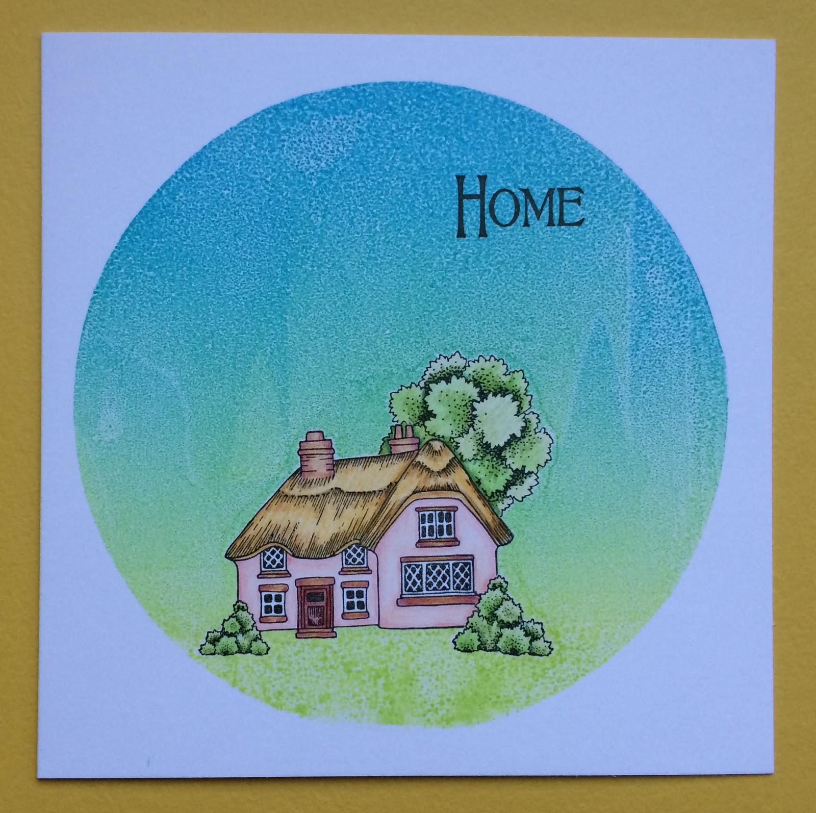
To create my cards, I made a mask using a piece of acetate, cutting an oval from the centre. This makes a really robust template, much stronger than paper, and the added bonus is that you can see where you are stamping, and it wipes clean for further uses. I was so happy with this idea, and I have developed it further for later projects, as you will see. I'm sure that others have done similar things, but as I do not watch gelli plate tutorials or YouTube demos, etc., I can honestly say, that this was something that I worked out for myself!

I chose a couple of colours of Distress Ink for my background, and loaded up my brayer with the first colour, and rolled it across the middle of the gelli plate. I cleaned off the brayer, by rolling it onto a piece of scrap paper, and loaded up the brayer with the second colour of ink. I then rolled the brayer across either end of the gelli plate, blending the two colours where they met.

I placed the oval mask into the centre of the gelli plate, and then placed a sheet of bubble wrap over the top of the gelli plate, pressing gently. I took the bubble wrap and oval mask away, and placed a sheet of white card over the gelli plate, smoothing over the back of the card, evenly, to ensure that I got a good coverage of ink. I peeled the card away from the plate, and laid it flat on my craft mat, placing the large acetate sheet over the top. Using a black fineline pen, I drew two wobbly borders inside the oval cut out.I chose two co-ordinating images from the Wild Meadow stamp set and using Versafine Olympia Green, I stamped the images onto the background. I removed the acetate sheet, and trimmed the card to size, before adhering to a large card blank.

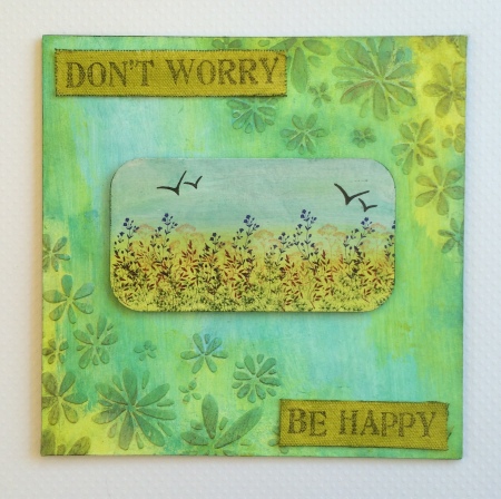
For my second sample, I repeated the process, but used a scrunched up plastic bag, instead of bubble wrap, to create the background marks. The oval piece of acetate created air bubbles on the cental section, but this looks quite pretty behind the flowers. That's the beauty of gelli plate prints, each one will be different.

I chose to add a faux stitching effect with the fineliner pen on the second sample, I always find this to be very therapeutic!

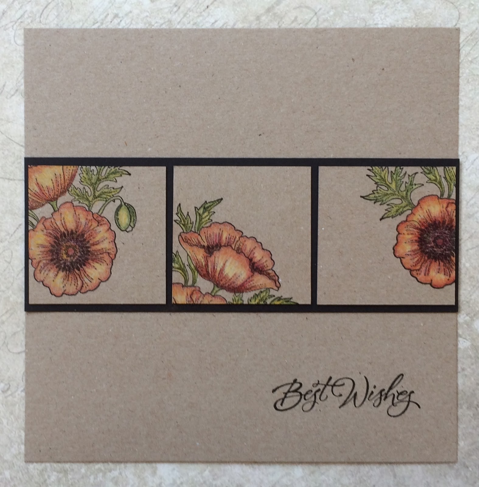
For my final card, I created another acrylic mask with three apertures. I used two colours of Distress Ink as before to colour the gelli plate, and then added the three circles to the plate. I took the large crackle stamp from the Echoes of Italy stamp plate, and stamped repeatedly across the gelli plate to take away some of the ink. I then removed the circles before taking the print with white card.

I added the piece of acetate, lining up the largest circle first, and stamped a flower from the Autumn Fairy collection using Versafine Ink. I stamped it a couple of times before re-inking, to get a group of flowers. I also spread the flowers up through the circle, heading towards the next circle.

I covered the largest circle with a piece of paper, and lined up the second circle, then stamped the same flower image into the second circle a couple of times. I also added a butterfly from the same stamp set. Finally, I added a sentiment in the smallest circle. I trimmed the card, and added a bit of shading around the edge of the background before adhering it to a white card blank.

Check out the new gelli plate show on the Craft Channel, and look out for Lesley presenting regularly too. Thanks for stopping by, Judith xx


Sunday 8 May 2016

Floral Heart Mixed Media Project

Hello everyone, I have a Design Team project to share with you today, using the new Flowering Baroque Heart clear stamp . This is such a pretty stamp, and a great addition to the clear heart stamp range.

I started my project by adhering some book pages to a chipboard heart, and once the background was dry, I coloured it with Distress Crayons; Antique Linen, Fossilized Amber, and Peeled Paint. I spritzed them lightly with water, and added a bit more here and there, moving the colour around with my fingers and a baby wipe. I dried the background with a heat gun, and stamped the heart image, using Versafine Onyx Black Ink. I stamped the image again onto a pale piece of scrapbook paper, and coloured the foliage on the spare image, and the heart on the chipboard shape with Polychromos pencils.

I cut the foliage image out from the scrapbook paper, and decoupaged it onto the chipboard heart, and added some fine glitter to the stamens of the flowers. I added some gold relief paste to the edge of the heart.

To create the main background, I glued some strips of bookpaper to a chipboard square, and added layers of acrylic paint to the background, drying each layer, to avoid muddying the colours. I painted some strips of lace to tone in with the flowers, added some tiny mosaic tiles, and stamped the word 'Love', from the Words of Love stamp set. I dry brushed the edges of the panel with some dark green paint.

Thanks for stopping by, xx

Wednesday 4 May 2016

Little Bird

Hello everyone, It's Wednesday, and that means another weekly post over on the Chocolate Baroque Challenge Blog. It is my turn to provide a little bit of inspiration using this month's challenge colours, and I have chosen to use one of the Spring Bird collection of stamp plates as a starting point. I chose the Spring Bird Crocus stamp plate, as I really like this particular bird image, and have used it several times in the past for projects.

I started my card by creating a Brusho background, using smooth watercolour paper, and sprinkling some powders onto the dry background. I chose a selection of ochres, oranges and lime green, which all fitted within the colour palette. I spritzed the background with a mini mister to create a watery background, and then blotted the background with a spare piece of watercolour card. This will be great for another project later on. I heat set the background using a heat gun.

I stamped the rosehip image from the Autumn Poppy stamp set randomly over the background using Potting Shed Archival Ink, and coloured the images using pencils.

I cut a circle from a spare piece of watercolour paper and stamped the bird image. I had laid my watercolour background onto a craft mat, and there had been some Brushos and water left behind, leaving droplets of colour. I used this to add some colour around the stamped bird image, just turning the circle of card, and gently dabbing it into the droplets, drying it between each application, until I was happy that I had enough colour. I then also used the leftover droplets to paint the bird image, using a small brush and some water. I used a little bit of extra brown Brusho for the actual bird. I used a bit of pencil shading on the leaves, to tie in with the background colouring. I added some shading around both layers using Wild Honey Distress Ink.

Finally, I cut some green card for matting and layering the bird image and my leafy background.

I have not added a sentiment to this card yet, but it would be suitable for lots of occasions, so I will wait until I am ready to use the card, before I decide what to add. Don't forget to hop over to the Challenge Blog, to see a super tutorial by one of my team mates this week. There is also a bumper post today on the Design Team Blog, featuring some of the readers' own projects, so a great reason to pop over there as well.

Thanks for stopping by, xx

Related Posts Plugin for WordPress, Blogger...