Hi Folks, my sample today uses lots of my favourite colours, namely purple and teal. I often try to work outside my comfort zone when I am making samples and do not often turn to these colours when making a project. it has been a real pleasure dipping into this colour palette.
I started my card by creating a wrinkle free background using smooth watercolour paper, using blue and lilac Distress Inks. I then created an oval mask, which I placed in the centre of the page. I used Paris Dusk Memento Ink and sponged around the edge of the mask, creating a shadow. This helps create a faux layer, which keeps the card flat and saves on postage! I also added the same colour to the edge of the background. Using a flower stamp from the Harebell Butterfly stamp set, I stamped around the edge of the background, and over the edges of the mask. I used a mixture of teal, navy and purple inks. I removed the mask and stamped the main image using Cobalt Archival ink. I stamped the butterfly from the main image again onto a scrap piece of watercolour paper and also onto sparkly acetate.
I bleached the image, and coloured it with pencils. I coloured the second butterfly, and stuck the acetate butterfly over the top. I added these to the main picture. The sentiment comes from the Amazing Birthday stamp set, and I have used a Dienamics die to cut out my little tag.
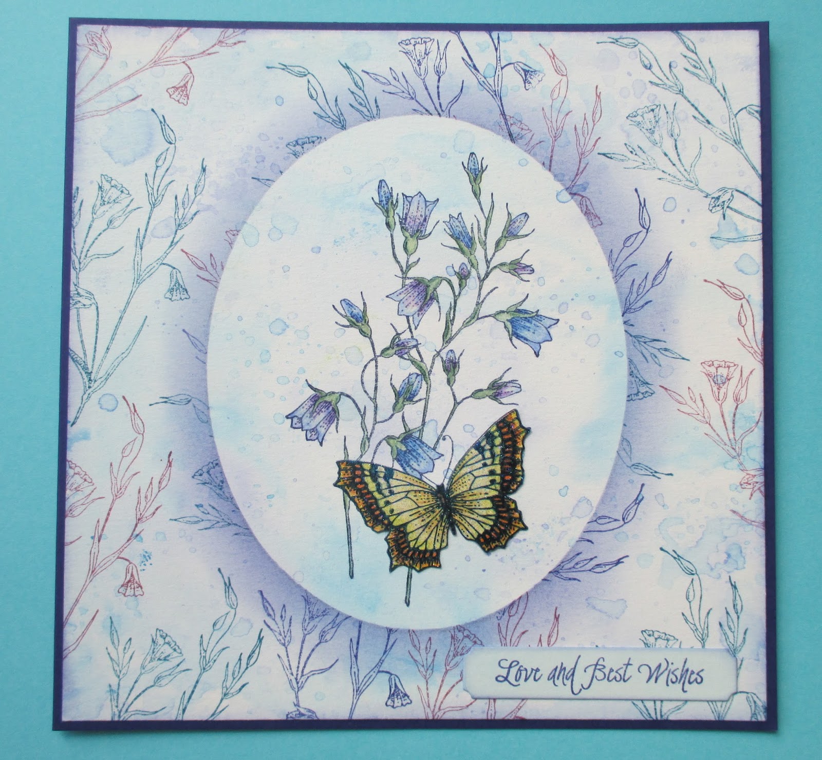
I added a bit of grey pencil directly around the edge of the mask to deepen the shadow, and this helps the contrast between the background and foreground 'layers'. Thanks for stopping by, xx

4 comments:
The colouring is so soft and delicate - fab card.
Hope you have a lovely weekend Judith x
Stunning Judith, I love how versatile these stamps seem to be. And I love how delicate this card is.
Sue xx
This is a lovely delicate colour scheme. I really like the soft wrinkle free background and how you have made the central panel pop out with the shading and stamping around the oval,the grey pencil has really added definition, but with a light touch, It almost looks like you have used a handmade textured paper for the background. The colouring of your images is as always lovely. Elaine xxx
The depth created by your shading around the oval mask really tricks the eye into thinking there is another layer for the focal panel. The effect is particularly powerful because of the contrast between by your teal, navy & purple floral stamped background & the clear, open oval of the focal panel. I love the way you coloured the Harebells in different shades of blue & violet - they really do look like that too when viewed from different angles or with shafts of sunlight shining through the flowers.
Paula (PEP)
Post a Comment