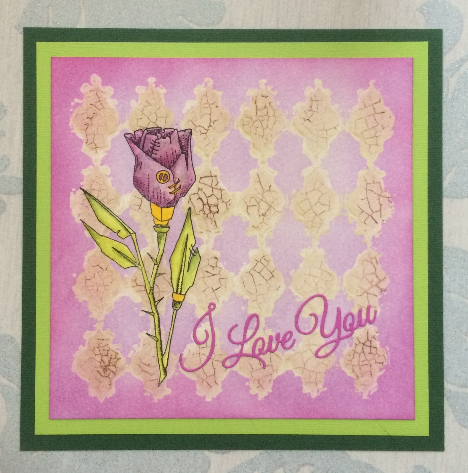
Hello everyone, I have a project to show you today using the Punky Hearts stamp sheet, currently on offer on the Chocolate Baroque website. It's coming up to the time of year when Valentine's cards are needed by ourselves, or requested if we make cards for other people. Here is an idea for the lovely punky rose.
I began my project by stamping and masking the punky rose on a piece of smooth watercolour paper. I then covered the background with a stencil, and using Memento Desert Sand ink, I coloured through the stencil. With the stencil still in place, I stamped the crackle stamp from the Echoes of Italy stamp set all over the background, using Memento Rich Cocoa ink. I stamped the image onto scrap paper each time first, so that I got a lighter image. This is called 'second generation stamping', as I did not want the ink to be too dark. Once the ink was dry, and with the stencil still in place, I brushed a layer of acrylic wax over the top, and allowed this to dry.
I removed the stencil, and covered the rest of the background with Memento Lulu Lavender ink, and then added a darker colour around the edges . The wax acts as a resist, protecting the area that was covered earlier. I buffed the wax areas, to remove any of the lilac ink, and the contrast between the two areas became much sharper.
I removed the mask from the rose, and coloured the image using more Memento inks stamped directly onto an acrylic block, which I picked up with a waterbrush. I picked out the 'metal' areas of the rose using a gold pen. I added a die cut sentiment, and matted the project onto green card.
Thanks for stopping by, Judith xx

3 comments:
This is a lovely interesting technique - I'd not realised that the wax would act as a resist but that makes sense. The darker brown crackle detail really enhances the whole steampunk grungy theme. I particularly like your use of the bold vibrant green on those leaves - it really brings the whole focal image forward & I can imagine that the gold gel pen on the metal parts provide a perfect metallic echo for the gilding wax. Your deep green base card enhances the & tones down the vibrant green at the same time, that's a really clever touch & so instructive to see in action as my instinct would have been to use black which wouldn't have had the same effect.
Paula (PEP)
Such a beautiful card Judith. I love the way you have created the background, when I first looked at it I thought that it was textured not that you had masked it with the wax. I must treat myself to some of this.
Sue xx
A great card Judith, with lots of skill needed to make all those layers work together for the harmonious end result you have achieved. Like Paula, I love the splashes of green, they really lift and integrate your whole design, the matting was one of the first things that drew my eye, I also would have gone instinctively for the black I usually use and your design works brilliantly. A lovely design and I was very interested to here how you had used the wax. Elaine xxx
Post a Comment