For my first project, I used a piece of background watercolour paper from my stash, already coloured with green Distress Inks, and added some stencilling, using the Useful Leaves Stencil and two different colours of green ink. I coloured some texture paste with Twisted Citron Distress re-inker, and spread it through the Seasonal Journey Stencil, choosing the word 'Spring'. Once the paste was dry, I added some green gilding wax to darken the colour slightly, and add some shimmer.
I stamped two butterflies from the Just Butterflies stamp set onto acetate using Versafine Onyx Black Ink, and embossed them with clear embossing powder. I coloured the reverse of the images with Copic markers, and cut the images out, before attaching them to the background. I chose a bright green card to mat the background.
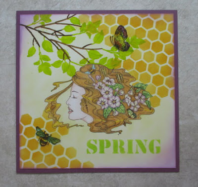
For my second card, I stamped the Spring Awakening image onto a piece of smooth watercolour paper, and masked the image. I coloured the background with Scattered Straw Distress Ink, and added some stencilling with a honeycomb stencil in two opposite corners. I used Wild Honey Distress Ink to add the stencilling.
I drew through the twig section of the Seasonal Elements Stencil, using a Distress Marker, and then added some leaves, using a bright green Zig Clean Colour marker. I used the same green to add the word Spring from the Seasonal Journey Stencil. I added some detail to the leaves with a darker green pencil.
I stamped a bee and butterfly from the Patchwotk Butterfly and The Rose Tree stamp sets onto acetate, embossing and colouring them exactly as I did in my first card. I removed the mask, and coloured the main image with Polychromos pencils. I added some deeper shading around the edge of the card, using Seedless Preserves Distress Ink, and matted the background onto some purple card.
Thanks for stopping by, xx


2 comments:
The different materials & textures in the first really catch the eye & I love the way those butterflies lead the eye to the words. The leaves & butterflies suffuse the design with movement. Your use of colours in the second just makes me smile for the Seedless Preserves edging & your purple mount just make the whole card sing - I particularly like the way your brilliant green leaves of the twig are echoed in her hair & by the lettering. The honeycomb looks like it is melting into her hair & again the eye is led from top right to bottom left: butterfly via girl to bee!
Two beautifully designed cards Judith, I love your fresh colours and composition of images, Kate
Post a Comment