Hello everyone, I have two cards to share with you today, showcasing the
Spring Fairy Collection
stamp plates, which were featured on the recent TV Shows on Hochanda.
My cards both started off in the same way, with a Distress Oxide Ink
background, and I then chose which stamps I wanted to use to complete
the cards.
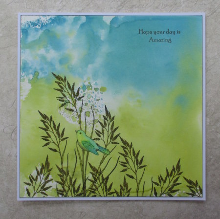
For the first card, I decided to create a
very clean and simple style card, choosing fresh blues and greens for
the background. I stamped the little bird image onto the card, using Potting Shed Archival Ink, and then I
masked the bird itself, before adding extra stamping using the foliage
part of the same stamp repeatedly across the bottom of the card.
I added some colour to the images with Zig Clean Colour markers. I added a sentiment from the
Words to Dazzle and Sparkle
stamp set, using the same ink as before, and edged the background with the ink as well, before adhering the background to a large card blank. I love this little bird stamp, it can be used for so many different occasions, and is great for masculine cards as well.
For my second card, I chose a selection of images from the
Spring Foliage, and
Silhouette Grasses
stamp plates, and using a selection of ink colours, I built up a scene
on my Distress Ink background. I stuck to a palette of greens and
purples, creating a tone on tone effect. I added a silhouette fairy and
butterfly from the
Spring Fairy Collection, plus the large 'Spring' from the stamp plate. Finally, I added some sparkle to the wings using a clear Wink of Stella pen.
Thanks for stopping by, xx


5 comments:
Two amazing cards, with lovely colours and stamps! Love that bird and the fairies, andthe inked backgrounds!
These cards are so delicate and pretty
I love them both, wonderfully coloured and designed, Kate x
I can see why you love that little bird stamp, you've used it beautifully here using the masking technique to get the abundance of foliage in place. I love how you've utilised the way that the ink spread to place the bird below the droplets & then used similar colours to the background for the bird - that really gives the effect of a camouflaged bird in its environment.
Your fairy scene really is magical & is so effective with the framing top & bottom using different types of foliage. I love the tone on tone effect & your use of the colour wheel to maximum effect with your choice of the colours. Enchanting!!!
I am just loving these two projects Judith and your gorgeous stamps used....of course I am now following you.xx
♥[aNNie]
Post a Comment