Followers

Showing posts with label Patchwork Landscape. Show all posts

Tuesday, 10 January 2023

Happy New Year to You All

Hello everyone, I hope that you are all keeping well. It's been a while since my last blog post, so firstly I would like to wish you all a very Happy New Year. 2023 looks set to be a very busy year for us on the personal front as our Daughter is getting married. We have lots of planning to look forward to, and no doubt the months will fly by as we head towards the big day.

I have lots to share with you today, as I did not manage to post last month. I will add a few projects from last month's TV shows, as well as some from the shows that we did just last week. I hope that you managed to watch the shows, we were very busy. The shows were our 6th Anniversary shows with the TV studios, it's amazing to think that we have been affiliated with the Company for that long. They have gone through a few name changes in that time, but we have enjoyed a good working relationship with them throughout the changes. I have been with Chocolate Baroque for a lot longer than six years, as those of you who know me will be aware. I have been on the Design Team for about twelve and a half years now, and Design Team Leader for eight and a half years. Goodness, I had to check, as I couldn't believe that it had been so long! 

Unfortunately Lesley was rather unwell last week, and so I needed to do a few more demos than I would do normally. I really enjoyed working with the beautiful stamps and so I had created lots of projects. I was ready to help out and show how to use the stamps in lots of different ways. My first project was created using some Drawing Cartridge, and stamps from the Technical Butterfly stamp set. I stamped and embossed the vacuum flange image using white embossing powder and Versamark over the background, and added Blueprint Sketch Distress Ink over the top. On a piece of scrap card, I stamped and embossed some of the butterflies, using Versafine Clair Nocturne and clear embossing powder, then coloured them in using a variety of Distress Inks and a blending brush. I cut them out and attached them to the background. I used a little strip of card and stamped the sentiment, brushing a bit of Distress Ink around the edge. 


The TV demo sample was a smaller version of my finished card, simply for speed.


 My second demo on the show was a journal page. I used stamps from some of our older stamp sets; Timeless, Make Your Mark, and Floral Parapernalia Elements. I also added colour to the background with a circle stencil and our own Chocolate Baroque Mask - Kaleidoscope of Butterflies. I used Distress Ink and blending brushes for the stencils, and Versafine Clair in toning colours for the stamps. I chose some stamps from Technical Butterfly to add to the page and then added the fabulous Friendship strip from the Mini Slim Words stamp along the edge. I added some coloured pencil accents to the images, sticking to a limited colour palette of blue, pink, yellow and green. 


 I only added the word strip partway along each page, but as I showed on my TV demo, you can easily join the word strip to stamp all the way along the page. I felt it was well balanced having it just along part of the side in my design, but it is really up to you how you use it.


As Lesley and I mentioned in the shows, we discussed the design of these stamps over a cuppa in the Green Room after one of the shows, we often do our brainstorming that way. We live so far apart, and we only meet up at the studios nowadays. Hopefully this year will see a few more new stamps in the pipeline, including some designs that I have had mulling over for a while now....

Anyway, here are one or two projects from last month's shows that I did not get a chance to share with you before. 

The first card is a remake of an old design, but I added some words from Words of Inspiration to the background. I used two of the little trees from Fantasy Woodland to make the flower.

I created an inky background for my next card by adding Distress Ink to an acrylic block and spritzing it with water. I placed it onto textured card. I have added stamps from Essence of Nature and Baroque Meadow, using Versafine Clair Inks.

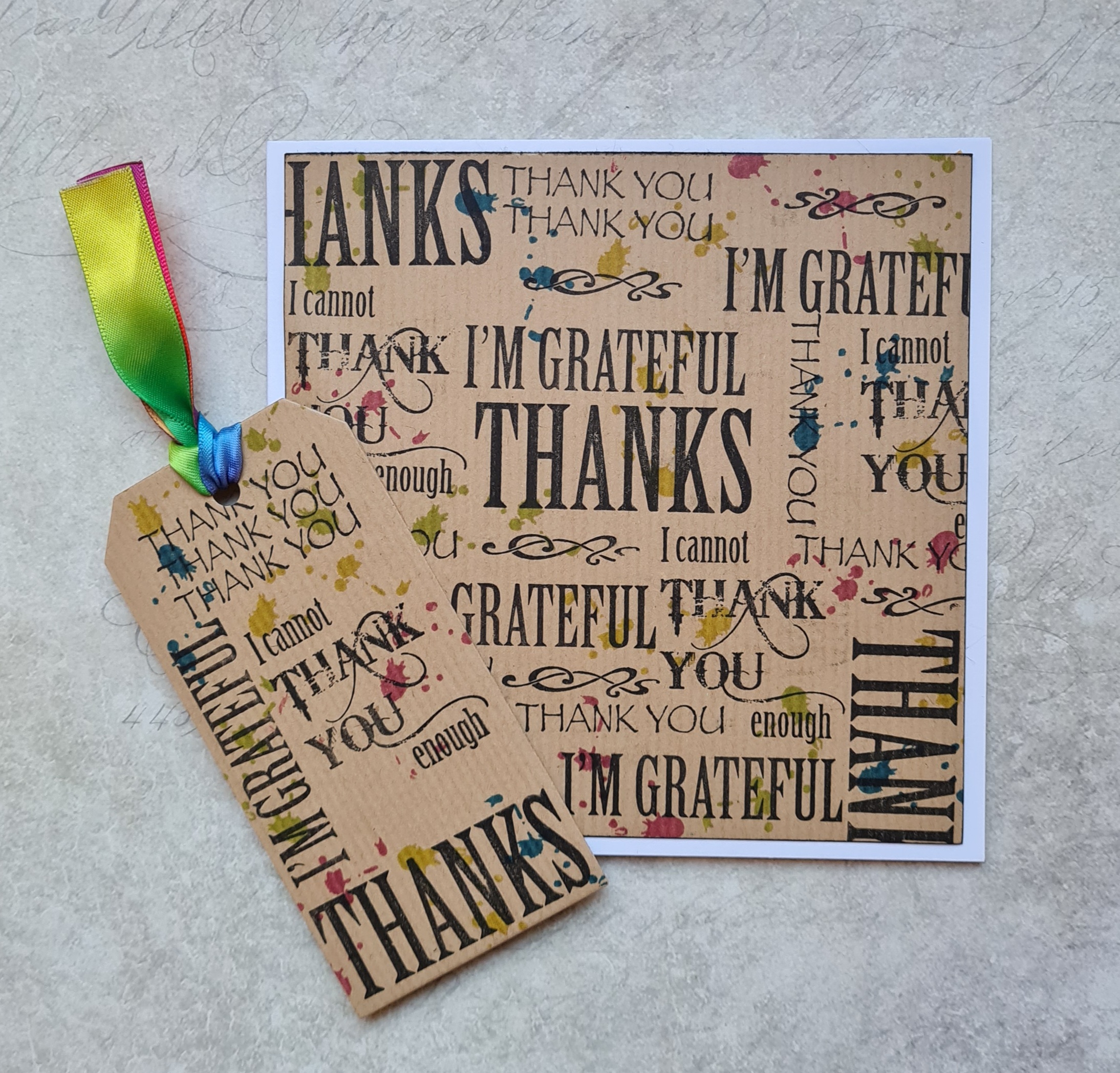
These next two cards were very quick and simple to make. I simply took a piece of white or kraft card, and added the splatter stamp from the Timeless stamp set, using coloured Versafine Clair ink. I then added words from Words of Gratitude over the top. I created a matching tag for a gift.

This was another quick card, using a piece of brown kraft paper for the background, to which I added Brushos and spritzed them with water. I stamped a sentiment from Essence of Nature all over the top, to make the background look like a book page. I coloured some Drawing Cartridge with the same Brushos, and stamped two more images from the Essence of Nature stamp set. I used clear embossing powder over the top.
I reworked an old design once again for this card, using the Patchwork Landscape stamp set. I stamped several of the images onto some Drawing Cartridge upon which I had already created a wrinkle free Distress background, and used a fine liner pen to add lines to create more hills and attach the images to each other. I used a circle mask to add more Distress Ink, to give the appearance of a sun. Using the fine liner pen, I added some birds freehand. I coloured the scene using pencils, choosing a palette of five colours, plus the slightly darker versions for shading.
I created an alternative colour option which is more masculine in grey and terracotta tones. You could use kraft card and add white accents too, or create a black, red and white version. There are so many possibilities, why not create a monochrome version in blues, or greens?

I hope that you have enjoyed my projects. I will be back later in the month to share more of this month's demos with you. Thanks so much for stopping by, your visits are always appreciated.

Take care, xx


Friday, 26 June 2020

Patchwork Sunset


Hello everyone, I hope that you are enjoying this warm weather! I thought that I would share a brightly coloured project with you today, showcasing some of the stamps from last month's TV shows on Hochanda. These colours probably reflect the tropical temperatures right now!

I started my project with a background created using Yellow and pink Distress Inks and water. I stamped some images from Patchwork Landscape using Versafine Clair ink. I added some lines using a fine liner pen to complete the scenery, and coloured the images with Koh-I-Noor Polycolour pencils. I stuck to a limited colour palette, and coloured the grass, adding shading using the same colours that I had used in the foliage and flowers, (pinks and blues). This stamp set is really great for scene building, and is so useful for lots of different purposes. You could vary the colours and create quite masculine cards by using grey, terracota and ochre, for example. Stamp and emboss in white on kraft card for a completely different look, there are so many possibilities.

Take care, and thanks for stopping by, xx

Monday, 8 June 2020

Tree of Hope

Hello everyone, I hope that you are all keeping well during these uprecedented times. Life is still very uncertain for lots of us, and for this blog post, I wanted to create a card with a message of optimism.

I started my project with a piece of kraft card, and stamped a large image from Trees a Crowd, using brown Archival ink. I added a little image from Sticks and Stones as foliage, using first and second generation stamping. I coloured the image using Koh-I-Noor watercolour pencils, and ran a waterbrush only over the first generation stamped images, as I wanted the colours in the other images to remain very soft. Adding water tends to brighten the colour somewhat. I added some colour under the tree to ground the image. A sentiment from Patchwork Landscape was perfect for this card.

To create a border, I ran the edge of an old credit card through the inkpad, and drew it along the card at various angles around the edge of the background. I added some shading with Rusty Hinge Distress Ink.

Thanks for stopping by, and take care, xx


Monday, 11 July 2016

Autumn's Smile

Hello everyone, I have three  projects to share with you today, using the current stamps of the month from Chocolate Baroque. Along with the rest of the Design team, I have been enjoying working with these stunning stamps from Sue Page, there are four beautiful women, one for each season of the year, and a gorgeous tangled tree, perfect for any time of the year, depending on how you choose to use the stamp. As Autumn is my favourite time of the year, I have created three cards celebrating that particular season, using the rich colours that can be seen before the Winter pulls in.

My first card uses the Autumn Medley rubber stamp to create an Autumnal card. I stamped the image using Versafine Onyx Black ink, and masked it before creating a leafy background, using leaves from my garden and Fossilized Amber and Rusty Hinge Distress Ink.  I coloured the image with Distress Markers, and added extra detail with watercolour pencils afterwards. I added one of my all time favourite sentiments, taken from the Nature's Peace stamp set. I matted the background onto green card, before adding it to a black card blank.

For my second card, I have created a wrinkle free Distress background, using Wild Honey and Seedless Preserves Distress Ink. I stamped the Tangled Birch individual stamp and added stamps from the Patchwork Landscape stamp set, before masking the tree and adding a stamp from the Seasonal Fragments stamp set to the tree, to create a scene. I coloured the images with Derwent Inktense and Faber Castell Aquarelle pencils.

My last card uses the lovely Autum Medley stamp once again, and I have created a border around the image, using stamps from the Autumn Poppy stamp set. I stamped the foliage using various colours of Archival Ink, and then coloured everything with Polychromos pencils. I decoupaged some of the leaves on the main image for added interest. I love the rich colours of Autumn, and have tried to reflect the changing leaf colours in this final sample.
Thanks for stopping by, Judith xx


Wednesday, 16 April 2014

Edging into Spring

Hi Folks, we are having some lovely Spring weather at the moment, and the latest stamps from Chocolate Baroque just fit the weather and what is going on in the garden perfectly.
I have a couple of cards to show you today. My first card uses the lovely gingko leaves from the Elegant Edges stamp set. I stamped the single leaf over the background using Versamark and clear embossing powder, which I heat set. I painted the background with a Ecoline ink, and then ironed the background placing it under some greaseproof paper to remove the embossing powder. This technique leaves a lovely smooth background.

I stamped the gingko border, and partially die cut an oval beside the border, which I coloured with Distress Ink. I coloured the leaves with Distress Markers. I added a sentiment from the Loving Sentiments stamp set. I stamped three butterflies from the Spring Fairy collection onto vellum, using white embossing powder, and coloured the reverse with Copics. Finally, I coloured some seam binding with green Ecoline ink, and crumpled it as I dried it, for a distressed effect.

 My next sample uses a mixture of stamps from the Patchwork Landscape stamp set and the Elegant Edges stamp set.

I have made a step card as my base and created layers of planting in front of the house, representing a cottage garden. I cut two strips of card, one 5" x 9", scoring at 1.5", 3", and 6", then another piece of card which measured 5" x 10.5", which I scored at 5" and 10". I stuck the little half inch tab to the back of the three inch fold created on the other piece of card, and then I had my completed step card base.

I stamped all of the images onto cream paper, using gold embossing powder, and coloured them with Distress Markers. I added them to the various layers of the step card. 


EDIT: I have been asked by a commenter to explain the construction of my card base. I am happy to do so, as my card is a DT sample and therefore inspiration for other to make something similar if they wish. I scored the shorter piece of card at 1.5", 3", and 6", which then gave me two mountain folds of 1.5 inches, and 3 inches. The larger piece of card was scored at 5" and 10", which gave me a mountain fold of 5 inches, with a half inch tab left over. I attached the tab just behind the three inch mountain fold, but could have tucked it under if I had wanted to. (The three inch mountain fold is the one with the hollyhocks on in the photograph). I am including a photograph so that you can see where I have attached the tab.


 Thanks for stopping by, xx


Monday, 7 April 2014

Patchwork Sunrise

Hi Folks, I had a lot of fun creating this 'patchwork' sample with the new Patchwork Landscape stamp set from Chocolate Baroque The stamps are such great designs, and just encourage lots of colour.

I stamped the main image, and then masked this off, by stamping the image again onto masking paper, and covering the main areas. I then covered sections of the background with sheets of paper, just leaving a segment uncovered, which I coloured with Pan Pastels. I stamped across the section with a stamp from various texture stamp plates, Abstract Fragments Nature Fragments and Texture Fragments using Versamark, and then I covered the Versamark with Pan Pastel again. I moved around the page, completing a segment at a time, covering over any finished area to keep it protected. Once I was finished, I added hand drawn pen lines to resemble stitching. I coloured the central image with Inktense pencils, blending the colours with a waterbrush. I added a sentiment from the stamp sheet. Finally, I made some small flowers from handmade paper to resemble the Hollyhocks on the stamp plate, and added some black buttons to the centre. A die cut flourish completes the card.

Thanks for stopping by, xx


Saturday, 29 March 2014

Just for Mum

Hi Folks, there are new stamps over at Chocolate Baroque and I have been creating some Mother's Day cards for two very special Mums.

My first card was created using a wrinkle free distress background on watercolour paper. I added some detail by using a Crealie mask and sponging some colour with Distress Ink. I stamped the small honesuckle stamp from the Elegant Edges stamp set over the background in toning colours. I used the large honeysuckle stamp from Fragrant Honeysuckle which I stamped onto a piece of oval watercolour paper and coloured with Distress Markers. The sentiment is taken from the For Mum clear stamp set.

I added some ribbon, and embossed Crealie butterflies to finish.


My second card was created by stamping the two Hollyhock stamps across a pencil line onto some green paper. I coloured the images using Polychromos pencils. I stamped the central image onto a piece of white card, and again coloured this with pencils. I wanted to hint at the patchwork nature of the stamps, so added stitching, using my sewing machine, lace, and buttons, to the centre of my flowers. The flowers are made from handmade paper, simply brushed lightly with Distress inkpads. The stamps, other than the sentiment were taken from the Patchwork Landscape stamp set.


Thanks for stopping by, xx

Related Posts Plugin for WordPress, Blogger...