Hello everyone, it is hard to believe that another year has passed.I hope that you have all had a good Christmas and are looking forward to the new year with optimism. I know that not all of you will have had someone to celebrate with, or are missing loved ones. I hope that you can enjoy the friendship that we offer at Chocolate Baroque through the blog, the Facebook Group, and the Ning Group. The groups are all very friendly, and if you sign up for Chocolate Baroque's weekly newsletter, you can find the links for each place in the newsletter. You can ask questions, pick up lots of tips, and find heaps of inspiration.
Personally,
I have had a mixed year, but I always feel that a new year offers the
possibility to try new crafting challenges, and to learn new skills. I
always want to be able to do something else! My craft room is bulging as
it is, but there is room for more, and I love to experiment with colour
and texture. My two projects that I am sharing with you today are both
very cheery, and will hopefully chase away the Winter blues. The first
one is a scrapbook page that I made as a TV demo for the Hochanda shows
last month, featuring Lesley's Designer Papers 8" x 8" - My Floral Soul, and the Movie Strip Collage stamp.
I started the project by stamping a fern from the Wild Meadow
stamp set onto the background, using Versafine Clair ink. I added a sepia photograph of my
parents, celebrating their golden Wedding Anniversary. I changed the
photo to a sepia effect, because I wanted to use it for a different
occasion. I stamped the flower image onto a spare piece of pale kraft card a couple
of times, and coloured it using Koh-I-Noor paints. I decoupaged the
image, and added it to the page. I made my own ticket, and stamped a
sentiment from the Shared Beauty
stamp set onto the centre. I added brown ink onto a couple of scrabble
tiles, which are my Mum and Dad's initials and a bingo piece, to
represent the number of years they have now been married, and also added
those to the background.
These
papers are lovely for scrapbook pages, they are the perfect size, and
are great to add a bit of stamped detail if you wish. I added a piece of
kraft card behind mine for extra stiffness.
My second project uses the same background paper , but in the plain version, to make a pretty card. I stamped the Be Kind
image onto some book paper a couple of times, using Versamark and gold
embossing powder. I added three different colours of Distress Ink for
shading. I also stamped and embossed the image onto a piece of kraft
card, and added the book page flower layers onto the kraft card script
layer. I then adhered this panel to the decorative paper. I stamped the
sentiment onto the background with a deep orange ink, which I then used
to edge the paper. A kraft card mat finishes the card.
Thank
you for your support in 2018, your visits to the blog, and your kind
comments. Have a wonderful New Year, and I look forward to your visits
in 2019.
Take care and best wishes, xxx
Followers
Monday, 31 December 2018
Saturday, 22 December 2018
Wildflowers Through the Seasons
Hello everyone, I have a project to share with you today ustilising the fabulous Tagtastic stamp featured on last month's TV shows on Hochanda. I wanted to show another use for this stamp, and paired it up with the Wild Meadow stamp set for my project.
I started by stamping the image on masking tissue several times, and cutting the image out. I then stamped the image onto my background using grey ink a couple of times, and then masked the images. I stamped the image again, masking those images, and continued, building up layers of the tag, until I had filled the page. I then added Fossilized Amber onto the background to fill in the 'blank' areas. I added different colours of Distress Inks to the tags, using reverse masking, and then stamped foliage into each tag using various colours of Versafine Clair Ink, while the reverse masks were in place. This meant that the foliage stalks did not overlap the edge of the tags.
I had great fun creating this card, and you could use the idea in a much smaller way for a tag or mixed media project.
I have a bonus project which I created more recently, as I needed to make a Christmas card for my lovely Hubby. I used one of Lesley's beautiful papers, one of the plain designs. I drew a circle in pencil, and added a few snowflakes, which I embossed using white embossing powder. I added a sentiment from the Let's Get Festive stamp set, and built the wreath using foliage from the Wild Meadow stamp set. I added a touch of shading used Seedless Preserves Distress Ink to make the snowflakes really pop.
I will be back later in the month with more ideas to share with you, but would like to take this opportunity to wish you all a very Happy Christmas. I hope that you can enjoy the day, whatever you are doing. Thanks for stopping by, xx
Labels:
Let's Get Festive,
Tagtastic,
Wild Meadow
Saturday, 15 December 2018
Flower Meadow
Hello everyone, it is time for the Fifteen Minute blog post over on the Design Team Blog today. I am sharing a card from that blog post here as well.
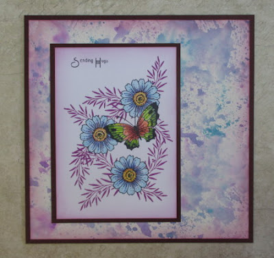
Lots of our projects feature Lesley's beautiful designer papers this month, and this card from myself uses one of the patterned papers from the collection. I have stamped foliage from the Wild Meadow stamp set using a variety of Versafine Clair inks, and then stamped the Floral Grunge flower onto the background, using a deep teal colour. I stamped the flower head onto one of the plain papers, and decoupaged it onto the main background. I also added a small butterfly paper pieced from a scrap of the same paper. The sentiment comes from the Be Kind stamp plate. I edged the paper with ink before adding it to a white card blank.
These papers are perfect for creating quick cards, whether you use the patterned, or the plain versions, they take surface stamping so well.
Do hop over to the Design Team blog and check out what my team mates have made. Thanks for stopping by, xx
Labels:
Be Kind,
Fifteen Minute Cards,
Floral Grunge,
Wild Meadow
Saturday, 8 December 2018
Rainbow Tags
Hello everyone, I have a project to share today using some of the
stamps and papers that we brought to you on last month's TV shows on
Hochanda. I wanted to use a little bit of everything in this project,
and incorporate lots of colour to cheer up these gloomier days that we
are having at the moment.
I started by stamping three of the Tagtastic tag shapes with Versamark, and covering them with white embossing powder. I also added three of the little tag 'hole' shapes onto the background of each tag, and then heat set everything. I stamped and embossed three of the flower designs, Shared Beauty, Floral Grunge, and Movie Strip Collage, and a little butterfly from the Wild Meadow stamp set onto some of the lovely papers designed by Lesley, and used the papers to help me decide on the colours that I used to colour each tag. I settled on three colours of Distress Ink for each tag.
Once the tags were coloured, I stamped the sentiments from the Shared Beauty stamp set over each tag in the same colours of Distress Ink. I cut the flowers and butterflies out of the papers, and adhered them to the tags, and then attached the tags to a tryptich made from corrugated card. Finally, I added some rainbow coloured ribbon to each tag.
Thanks for stopping by, xx
Wednesday, 28 November 2018
Stamping on Fabric
Hello everyone, I am sharing two projects today using the stamps that we showcased on last month's TV shows on Hochanda. This time, I have created my projects using fabric, showing how you can create a quick card, and a decorative panel.
For my first project, I painted a piece of spotty fabric with yellow and green Hybrid paint, blending the two where they met. I used coloured Archival inks in green and brown tones to stamp all of the images, creating a meadow scene in first and second generation stamping, just as I would when creating a card. I added a couple of Butterflies, and then painted the images with Koh-I-Noor paints and a waterbrush. The Koh-I-Noor paints worked really well on the fabric, and because I am not planning to wash the piece, it does not matter that they are not waterproof.
For the larger panel, I used the large corner stamp from the Butterfly Daisy Collage stamp set, and stamped around the edge of a piece of patterned fabric, overlapping the image as I went along. Again, I used coloured Archival Ink. I used iron on interfacing on the back of both pieces of fabric, fraying the edges of the top panel, and adding rust coloured Archival Ink to the bottom panel. I used a thick piece of greyboard as a base.
I had a piece of the spotty material left over from my first project, and stamped two of the large butterflies from the Butterfly Daisy Collage stamp set onto the fabric, adding shading with the Koh-I-Noor paints. I also stamped some words from the Amazing Mackintosh Words stamp set, and frayed the edges of the little panels.
I created a wrinkle free distress panel using tones of green and yellow Distress Ink on a piece of watercolour card for a background. I stamped a leafy sprig in second generation stamping randomly over the background. To complete the card, I used a small piece of eco printed fabric, with a lovely leaf printed in the centre.
Thanks for stopping by, xx
Friday, 16 November 2018
Penpal Journal swap
Hello everyone, I have a slightly different project to share with you today. I have recently been taking part in a penpal journal swap, organised by the lovely Di Oliver from Tando. The aim of the swap is to create a journal, and send five letters to a partner, making journal pages along the way. At the end of the time, each of you will have a completed journal, and know a bit about each other as well.
I have had a very busy time lately, and some personal things going on as well in the family. These have taken up a lot of my time, and it has not been easy to find the time to make the journal on top of everything else that I needed to do. However, I really enjoyed the experience, and took the opportunity to use some of my neglected craft supplies to create the project.
To start my journal, I used some greyboard journal covers, available from Tando, and covered these with book pages. I coloured the pages with Cadence paints in shades of blue, green and lilac, I diluted them with water, using them as a wash. These pretty metallic shades blended beautifully together, and created a soft background for everything else, and still allowed the book pages to show through.
I added some gesso through a stencil, and then started my stamping. I used stamps from Rock and Rust to add texture to the background, using Archival Ink, and added highlights with a white gel pen. I also added an image from the Perfect Words stamp set in amongst the other texture on the background.
On a spare piece of card, I stamped some of the dragonflies and bees from the Creepers and Crawlers stamp set, colouring them with Koh-I-Noor paints, and cutting them out. I attached them to the journal covers. I added a couple of the words to the front cover.
Next up, were my pages, I wanted to represent myself as much as possible, showing my love of colour, and what makes me tick, so to speak. The first page was very similar to something that I had made in a recent course that I had completed, and had really enjoyed. I covered the page with vibrant acrylic paint, adding a leafy stencil using white paint over the top. I wrote some words that had meaning to me, using a white gel pen. Using black paint, I painted my buddha, and added shading using the same colours of paint that I had used for the background.
These faces feel very peaceful to me, I am not a Buddhist, but I do go to yoga regularly, and these images conjure up the same feeling of tranquility that I get when I get when I am attending my yoga classes.
For my second page, I used similar colours, starting with a book page, as I has done for the journal covers. I added some shading with Distress Inks, creating an ombre effect, then places a stencil over the top, and applied more of the same colours. I used some stamps by Kay Carley to complete the page. The large flowers and leaves were stamped onto patterned paper and decoupaged. I added a bit of extra colouring with Koh-I-Noor paints.
These two pages formed the outer covering for the first letter to my penpal.
To create my letter, I added a napkin to the bottom portion of the reverse of the page, and painted the top half with a wash of colour. I added some additional stamping, in particular, two black cats from Lavinia, to represent my cats, Poppy and Bella. This next photo is a bit fuzzy on purpose, it is not my bad photography!
I hope to share the rest of my journal with you as I go along. It has been enormous fun so far, and hopefully you have enjoyed seeing something a bit different from me for a change.
Thanks for stopping by, xx
Thursday, 15 November 2018
Quick Masked Cards
Hello everyone, today on the Chocolate Baroque Design Team blog, we are sharing our bumper Fifteen Minute blog post; a post full of quick and inspirational projects designed to show how a card can be made in fifteen minutes or less. I have two cards featured in the blog post and am sharing them here as well.
I have used the same layout for both cards, but varied the colours and stamps. I masked the top and bottom of a white card blank, using strips of masking tissue, before adding Distress Ink. I stamped the foliage, and then stamped the butterflies onto sparkly acetate. I added coloured vellum behind the acetate, and adhered the butterflies to the card. A sentiment completes each card.
The first card is a remake of an old favourite, simply changing the sentiment. I chose warm colours, red, orange and yellow, adding water splatters for added interest:
The second card is in cool tones, greens, lilac and blues. The water splatters look fab on this one, they are always random. The vellum works really well behind the sparkly acetate and is a very quick way of creating these butterflies.
Do hop over to the Design Team blog to see what my Team Mates have made today.
Thanks for stopping by, xx
Wednesday, 14 November 2018
Painting with Bleach
Hello everyone, I am back with another project to share with you
showcasing the stamps that we brought to you on last month's TV shows on
Hochanda. I wanted to revisit a technique that I love to use in
conjunction with Distress Inks, painting with bleach, it works so well,
and these stamps are a great way to show off the technique. I made a
larger project a while back using the very same technique, and I will
share a couple of photos of that project with you at the end of my post.
I started my project by creating two panels, one large and one smaller, shading them with Distress Inks in a rainbow panel. I started in the middle with yellow, and worked out using orange and red on one side, green, blue and purple on the other side. I made sure to blend the colours smoothly, going back over the joins where necessary with the previous colour. I matted both layers with black card, and turned them so that they were facing the opposite way to each other when I put them together.
I coloured some spare card with Distress Inks, and stamped a couple of flowers and a butterfly from the Butterfly Daisy Collage stamp set onto the card using Archival Jet Black ink. I painted parts of the image with neat household bleach and a fine brush. IMPORTANT: do make sure that you are working in a well ventilated area when you do this. I cut the images out, and stamped a foliage image onto the smaller background a couple of times using black ink. I curled the petals of the flowers and butterfly slightly before adhering them to the background. I added a sentiment from the Loving Sentiments stamp set.
As you will see, I was very much inspired by my previous project! This flag book uses lots of our other stamps, but incorporates stamps from other companies too. Lesley is a huge advocate of mixing and matching our stamp sets together, but encourages you to use your Chocolate Baroque stamps with your other stamps as well.
I used the same techniques throughout this book, Distress Ink backgrounds, stamping with Archival Ink, and painting with bleach. I have added a bit of stencilling here and there for added texture, and a few small embellishments. I hope that you will give this technique a try, it's a lot of fun, and depending on the colour of ink that you use, the results vary.
I will be back later in the month with more inspiration, thanks for stopping by, xx
Labels:
Butterfly Daisy Collage,
Loving Sentiments
Saturday, 3 November 2018
Masking Butterflies
Hello everyone, I am sharing two cards with you today created for
last month TV shows on Hochanda. If you caught the shows, you will have
seen me demoing the first card, and showing the second card as an
alternative option for the technique that I used.
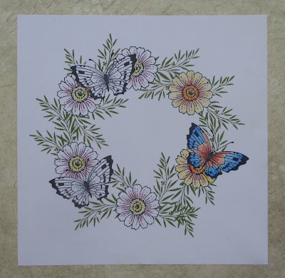
To create my card, I drew a circle with a pencil onto a piece of smooth white card using a circle die, but anything the right size will do. I then stamped three butterflies into the card using Versafine Onyx Black Ink, and masked the images using masking tissue. I stamped six daisies from the Butterfly Daisy Collage stamp set around the circle, three close to the butterflies, and masked those as well. I used a foliage stamp from the Thistle Butterfly stamp set to create the background leaves for the wreath, using Shady Lane Versafine Clair ink. Once I had finished, I removed the masks, and coloured the images with pencils. I added a sentiment from the Words to Dazzle and Sparkle stamp set.
My second card was created in much the same way, but I based the colours on my background, which I had found in my stash box. This was simply a wrinkle free Distress Ink background, using Seedless Preserves and Salty Ocean Distress Ink. I stamped the butterflies first, masking them as before, then adding the daisies behind. Finally, I added the same foliage stamp to fill in the background, using Purple Delight Versafine Clair ink. I coloured the images with pencils as before. I added a bit of shading around the edges of both pieces of card with Seedless Preserves Distress Ink, and used a purple card to mat both layers. The sentiment comes from Amazing Mackintosh Words.
To help me plan both cards, I placed my masking tissue images onto my pieces of card first, moving them around to see how they would fit, this helps to visualise what the card will look like. I also stamped my wreath onto a piece of copy paper first, trying out the design, and various colour options for the flowers. I would always advise you to do this if you are unsure about a design, copy paper is very cheap, and you can have several attempts at something, without worrying about your mistakes, before moving onto card.
Another top tip regards colouring in your images. I have used quite a limited colour palette, and have used orange and red in both the flowers and the butterflies in my first example as you can see in the photograph below, to keep some continuity to the images. In the photograph above, although it is not obvious, I have added blue to both the flowers and the butterflies, (along the outer edges of the wings), to again pull everything together. I always choose a toning card to mat the layers in my project, or use ink to edge the panels of card that will coordinate the colours I have used. I hope that this helps you in your own creative process.
I will be back later in the month with more designs to share with you. Thanks for stopping by, xx
Thursday, 25 October 2018
Kim Moody Houses
At the beginning of the month, a new range of stamps designed by Kim Moody were launched on Hochanda. These quirky stamps have been manufactured by Chocolate Baroque, and I was lucky enough to get to work with the stamps, providing some samples for the TV show. You can check out Kim's stamps on the Chocolate Baroque website by heading for the Kim Moody section.
For my first card, I die cut an oval aperture from a piece of card, and stamped some of the flowers from the Patchwork Landscape stamp set along the bottom of the card. I coloured these with Inktense pencils, and ran over them quickly with a water brush afterwards. I stamped In an English Country Garden onto another piece of card, and coloured this with the same pencils, adding splotches of colour in the foreground to represent the flowers growing in the garden. I attached the image behind the oval before adhering the panel to a black mat layer and then to a card blank.
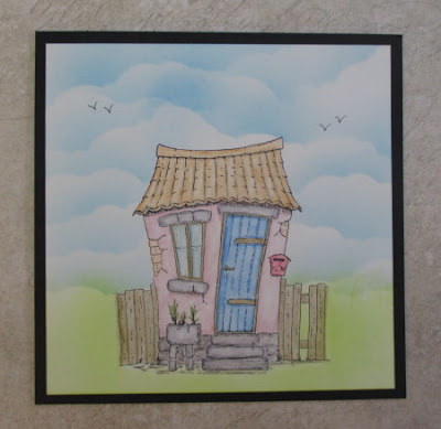
For my second card, I stamped Head Office and masked the image. I coloured the sky using a stencil and blue Memento Ink, then used a green Distress Ink for the grass. I used Inktense pencils to colour the image,and added some hand drawn birds. Although Inktense pencils are normally very vibrant, I created a washed plaster look to the walls of the house, by adding very little pencil to the paper, and drawing it out with the waterbrush. I did the same with the stone work, and it seemed to work very well.
I stamped La Maison, and again masked the image before stamping Glade Design a Tree. I added foliage using shades of green and orange in first and second generation stamping for added depth. I used Distress Inks to watercolour my image and background, using an orangey brown for the doors to tone in with the foliage.
These images are great fun to work with. I have a couple more that are unfinished that I will try to blog in due course. Do check out what my Team mates created over on the Design Team blog.
Thanks for stopping by, xx
Labels:
Head Office,
In an English Country Garden,
La Maison
Tuesday, 23 October 2018
A Collage of Colour
Hello everyone, I have a mixture of projects to share with you today,
showcasing the stamps featured on last month's TV shows from Hochanda.
My first project uses the lovely Birdcage Collage stamp as my focal point. I created a colourful background using Turquoise and Lime Green Brushos spritzed with water, and pressed a piece of crumpled cling film over the top, to add a bit of texture to the background. Once the Brushos had dried, I removed the cling film, and stamped some of the words from the Amazing Mackintosh Words stamp plate over the top, using Archival black ink.
I stamped the Birdcage Collage onto a spare piece of Drawing Cartridge, and coloured the image using water Distress markers and a water brush. Finally, I cut out the image, and attached it to the background.
For my second card, I created a piece of background using Seedless Preserves and Fossilized Amber Distress Inks, which I had added to my craft mat and spritzed with water. I picked these up on the Drawing Cartridge a couple of times, drying each layer in between. I coloured a piece of Stampbord with the same colour of inks, and the stamped the deco edge from the Decorative Edges stamp set on both the Stampbord and the background, using a plum coloured ink. To finish, I added a piece of ribbon, and some Little Birdie flowers.
My final sample is a reproduction of one I made a long time ago, however I liked the design, so why not? I stamped the Butterfly Dress image onto a piece of smooth card, and masked the image. I stamped the Floral Edges image across the bottom twice. I added clouds using a stencil and Memento Summer Skies ink, but you could use torn paper or a frilly die cut to achieve a similar look.
I stamped the Butterfly Dress image twice again onto spare card, and then coloured the flowers and butterflies, plus the main images all with Polychromos pencils. I added the extra butterflies to the background flying around the lady, and along the floral border.
Thanks for stopping by, xx
Tuesday, 16 October 2018
Speedy Cards
Hello everyone, it is time for the monthly Fifteen Minute blog post over on the Chocolate Baroque Design Team Blog. I am sharing two cards from the bigger blog post with you today.
The first card was created by stamping the Auricula Script image onto Kraft card using Versamark and white embossing powder. I coloured the image using Koh-i-Noor paints. I added some shading around the edge of the kraft card with Seedless Preserves Distress Ink. I made a toning background using Seedless Preserves and Fossilized Amber Distress Inks on drawing cartridge. I matted the background onto plum and kraft card, and added some coordinating ribbon.
For my second card, I stamped the same image onto a piece of drawing cartridge, using Plum Archival Ink, and coloured it with Inktense pencils. I painted Stickles onto the flowers and leaves with a thin brush. This does not take very long to dry. I stamped an image from the Floral Edges stamp set onto a piece of Crafty Individuals paper, using the same ink as before, to create a border. I edged the drawing cartridge and patterned paper with the plum ink, then matted everything onto purple and green card.
Do hop over to the Design Team blog to see what my Team mates have been creating. Thanks for stopping by, xx
Tuesday, 9 October 2018
A Little Piece of Tranquility (by Judith)
Hello everyone, I am sharing two projects today using stamps that featured on last month's TV shows on Hochanda. Both projects have a very tranquil feel about them, although they are very different. I find that crafting helps me feel quite calm and relaxed, and these two pieces really reflect that feeling.
My first project is a piece of home decor featuring a Buddha image. I am very drawn to this type of image, even though I do not practise any kind of leaning towards Buddhism itself. Most of you know that I am a keen yoga enthusiast, and it is maybe that which has drawn me to these images so much.
I created the project by colouring two pieces of drawing cartridge with Distress Ink in tones of blue and green, Salty Ocean and Twisted Citron, blending the colours where they met. To the larger piece, I added background stamping, adding the harlequin edge from the Decorative Edges stamp set, and the bubbles image as well.
On the smaller piece, I created a mask from masking tissue in the shape of the headdress, and placed it on the the background, and stamped the bubbles image through the mask. I painted the little top knot by hand. I then used some blue Koh-i-Noor paint to paint the rest of the image freehand, adding some blue, green and orange shading to complete the image. I stamped the bubbles image along the top and bottom of the panel to create a bit of a frame, and painted some of the bubbles in the headdress using the same colours as before. I added some orange shading around both panels before attaching them to a piece of grey mountboard.
Finally, I stamped the Butterfly Dress image onto a spare piece of card, and coloured the butterflies using green and orange tones, before cutting them out and attaching them to the panel. Some words from the Amazing Mackintosh Words stamp set complete this project.
For my second project, I wanted to create a tranquil scene with a coloured panel spotlighted in the centre. I used torn paper to create the hills and ensured that they lined up on the background and extra panel. I used grey/lilac tones for the larger panel, and greens and blues, with a hint of lilac for the foreground panel. I then added the foliage from the Floral Edges stamp set to complete the project, with a sentiment from the Amazing Mackintosh Words stamp set, as before. I added a piece of black card to frame the coloured panel, as I liked the definition that this gave the coloured panel.
I hope that you have enjoyed my projects today, I will be back later in the month, with more ideas to share with you. Thanks for stopping by, xx
Saturday, 29 September 2018
Eastern Skies
Hello everyone, I am sharing more cards using stamps featured on last month's TV shows on Hochanda.
My first two cards came about when I made the backgrounds, which were a mixture of Red, Yellow and Orange Brushos sprinkled onto drawing cartridge and spritzed with water. I also added some Gold shimmer for some added bling. I like to create one piece, and use a second piece of the drawing cartridge to blot the excess liquid off the first, creating a second background for later. Both pieces end up a bit less vibrant, but I do not mind this effect, especially as I am creating the second background for free as such.
When I looked at the backgrounds, they looked as if they had a sandy foreground, and a sunset sky, which made me think about creating some sort of scene with the backgrounds. Every background turns out differently when you are using Brushos, and it was just luck that these two made me think of making this sort of card.
I cut a square of copy paper, and placed it in the middle of the background, then stamped the paisley image from the Paisley Elephant stamp set all around the edge, using purple Versafine Clair ink, to create a border. I used the same colour ink to add the sentiment from the same stamp set. On my first card, I used the Chocolate Baroque Mask- Silhouette Palace 1, with Seedless Preserves Distress Ink.
On the second version, the card that I demoed for the TV shows, I simply stamped an image from the Indian Textiles stamp set, using a deep plum ink.
These one layered cards will be cheap to send through the post, even though they are a bit larger in size. If you vary the colours, they would be great masculine cards. I have kept them fairly monochrome, if you made them in blues or greens, or brown tones for example, they would look equally effective.
I am sharing a much older card with you as well, which uses this same image. Long time followers will have seen this card, but I thought that newer viewers would like to see the card as well. I stamped and embossed the building using white embossing powder, and then created the background with inks. I used masks for one side of the background and then the other. I stamped a tree image from the Landscape Edges stamp set along the horizon, and a flower stamp from the Floral Edges stamp in the foreground.
The elephants were stamped onto a spare piece of card, coloured with Distress markers, and then decoupaged onto the background.
Thanks for stopping by, xx
Subscribe to:
Posts (Atom)